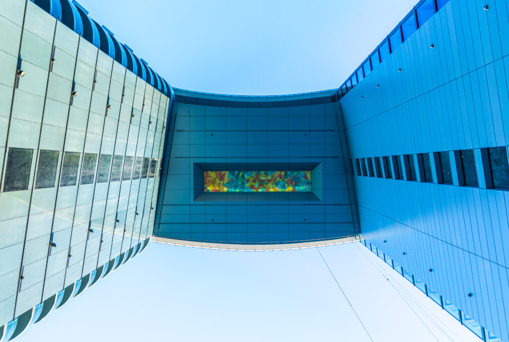
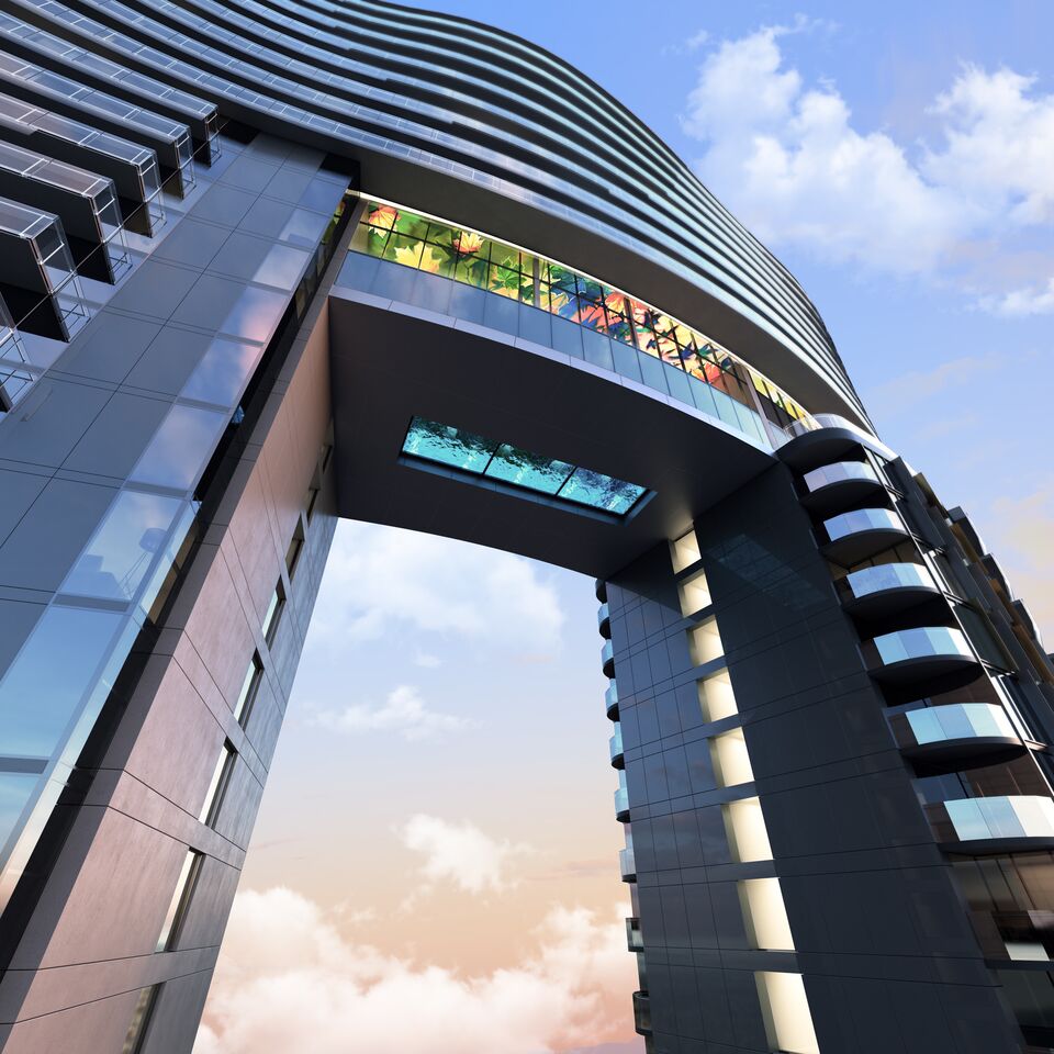
Concord Pacific has unveiled one of the most striking towers Vancouver has ever seen at the North end of the Cambie Street bridge. As a nod to new ‘Vancouverism’, The ARC is a bold, luxurious ‘gateway’ to Vancouver’s downtown – a modernist (and residential) take on civic arches like Paris’ L’Arc de Triomphe or Saarinen’s Gateway Arch in St. Louis. These two conjoined towers will forever change our city’s skyline and introduce much needed housing stock to the Vancouver market.
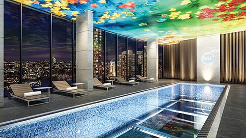
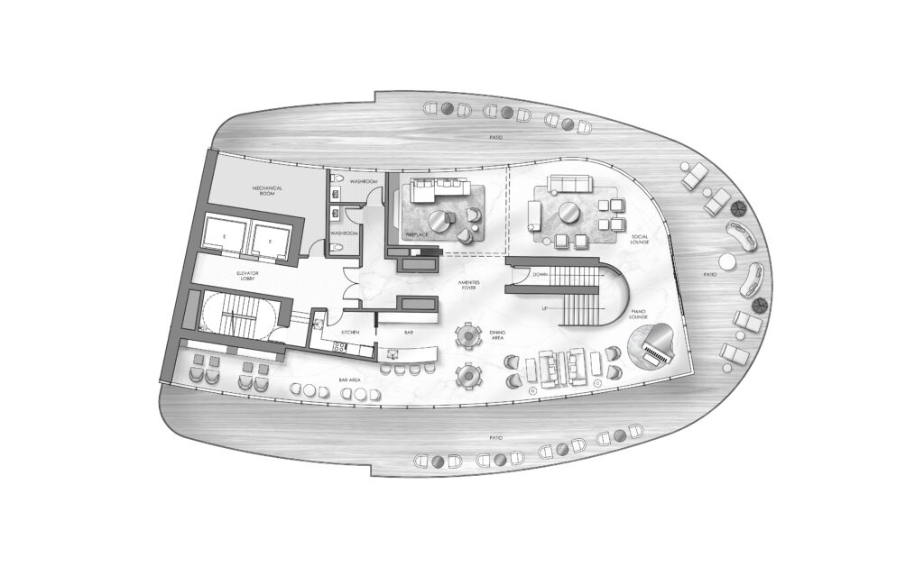
More importantly, the ARC pioneers a serious commitment to community and urban living thanks to significantly larger and better communal spaces. Compared to other residential projects, The ARC has dedicated expansive areas to amenities and community life including a ground-breaking, gravity-defying glass bottom pool, a spa with tepidarium and therapeutic Mr. Steam experience showers, state-of-the-art fitness centre, cappuccino lounge with landscaped gardens and a grand outdoor patio – all with jaw dropping city views. This focus ensures residents are enticed to expand their horizons beyond the confines of their suites – to build community and friendships through organic encounters with neighbours in these gorgeous spaces. For LIV, this is the new Vancouverism – design that encourages community.
Challenges

- The LIV Design team was presented with a 5,000 square foot area purely dedicated to amenity space. At the start of the project four years ago, the focus and significance of large communal spaces was just beginning. The team conducted extensive research to better understand how people interacted and utilized large community spaces in condo complexes, including how each space was designed to flow from one to another. Furthermore, unlike most interior design projects, the interiors of these amenity spaces would be visible from the outside. Considering the visual drama of the exterior architecture, conceptualizing a complementary interior without detracting from the stunning architecture was both exciting and challenging for the LIV Design team.
- One of the biggest challenges was the illuminated ceiling. The large scale plus the unique shape of the building created a host of design and logistical problems:
- Due to the unique shape of the building plus the vast amount of natural lighting, numerous mock ups were required to achieve the vision of the illuminated ceiling.
- The void space between the tendered lighting and fabric ceiling was not enough to reduce the visible LED line strips. In order to reduce visibility of the LED lights, the fabric ceiling had to be dropped lower.
- Mechanical installations were larger than originally anticipated forcing the ceiling lower and causing a ripple of changes to the design.
- The team wanted to stay true to the design philosophy of the space – a calm and relaxing area for residents. Therefore, extra care and attention was paid to the final colour of the ceiling as too many warm hues changed the way one interacted and felt within the space. Eliminating heavy spots of colour due to light and print factors was a lengthy, iterative exercise ultimately solved through collaboration and multiple mock ups.
- The ARC building is an engineering and architectural marvel that features a glass bottom pool 200 feet above ground, spanning 38 feet in length and connecting the two towers. Construction efforts required numerous structural improvisations and changes that needed to be reflected in the design. For example, MEP (mechanical, electrical and plumbing) would require additional space, which would then require design changes to the spaces affected. Weekly site visits were required to oversee and examine how design needed to evolve due to given site conditions.
- The building’s curves also created a ripple of challenges as well. In plain view, the shape of this building is a very elegant and subtle ‘S’. As a result, there are almost no straight lines or 90 degree angles present in the space. This created challenges with customizing the shape of the rugs and the illuminated ceiling.
- The two building lobbies are relatively compact and featured curved walls so LIV needed to use smart design to visually expand these spaces – careful attention was paid to lighting, colour and materials selection.
Design Concept & Inspiration
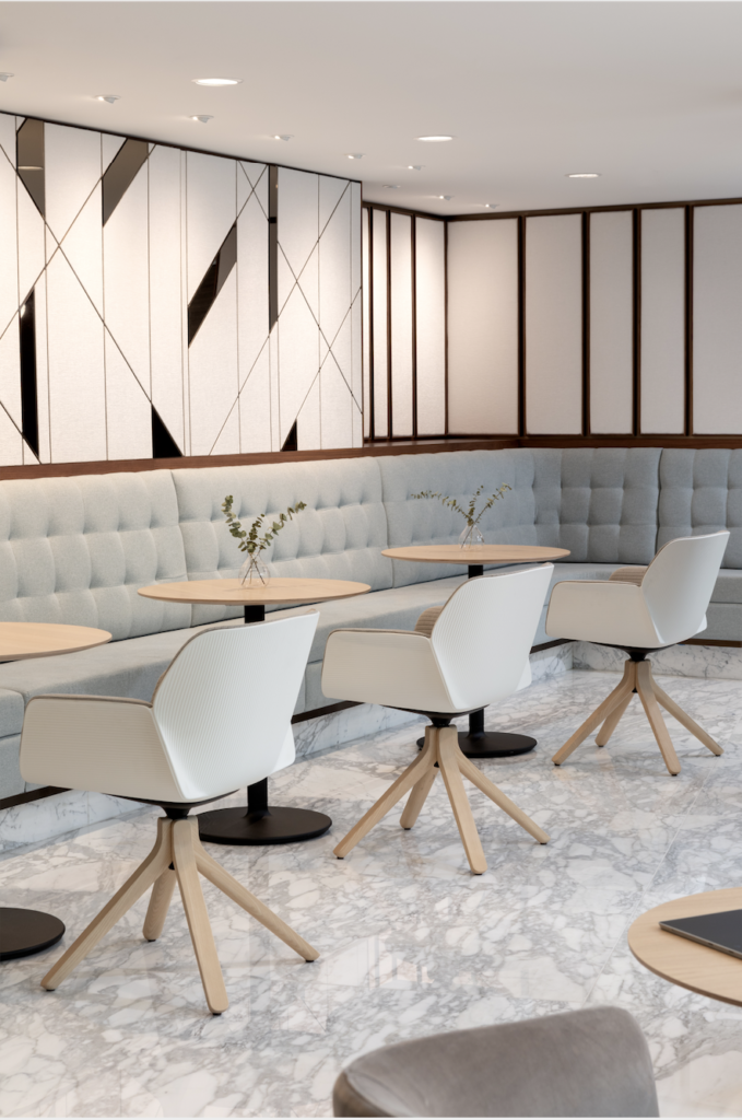
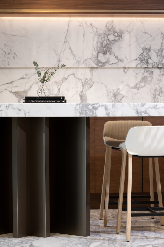
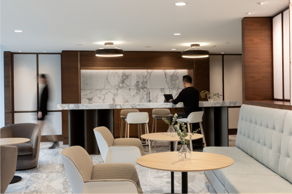
For the common areas in The Arc, the client wanted to capture the feeling of a luxury hotel. For them, this would be a key differentiator setting this development apart from other multi-residential buildings in Downtown Vancouver. The LIV Design team began by looking at various high-end, luxury hotels in Europe for inspiration, making careful note of how guests used the lobby and amenity spaces, what kind of finishes were used, and what kind of features were memorable.
The team spent a lot of time refining the wallpaper and carpet designs for the long corridors to ensure they conveyed a luxury resort experience. Furniture for these areas needed to be durable and timeless as well as beautiful to accommodate many residents and appeal to many tastes.
-
ARC Common Area | Photo: Ema Peter -
ARC Common Area | Photo: Ema Peter
Lighting, too, was very important for creating a hotel feel. Wall sconces were custom designed by our team to enhance every carefully selected design element and finish – from the wallpaper to the carpets – to encourage ‘flow’ and a seamless transition to the condos. In addition, ceiling height was maximized in all common areas to expand the space and convey a luxurious, relaxing ambience.
-
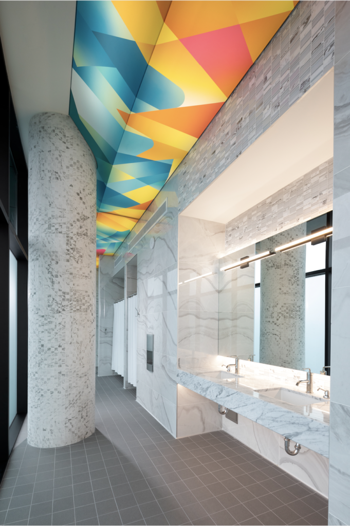
ARC Changing Rooms -

ARC Common Area -
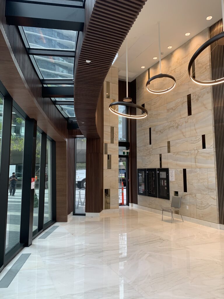
ARC Lobby
Collaborations
In order to overcome the architectural challenges of the building, LIV worked closely with numerous experts in order to achieve the vision for the ARC. Francl Architecture, the building architects and the mastermind behind the 200ft high glass bottom pool, worked closely with the team to fine-tune the flow of the interior space, from one amenity area to the next. Barrisol and Nemetz Lighting provided key insights and custom solutions in order to bring the illuminated ceiling vision to life.
Custom Installation – Illuminated Ceiling
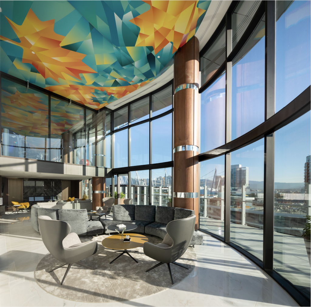
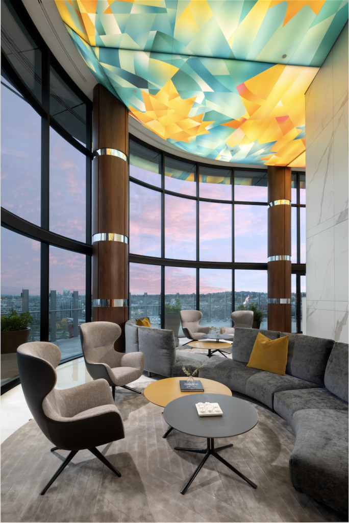
Inspired by lantern festivals, hot air balloons and various art installations, the “Ode to Canada” ceiling is a colourful, captivating and consistent feature above all the ARC’s amenity spaces. The graphic of the illuminated ceiling changed numerous times from initial concept to what it is now – beginning with flow & water, to geometric shapes, to the abstract maple leaf collage we see today. The team collaborated with graphic Designer Candelaria De La Losa to conceive and realize this vision. One of the biggest challenges was bringing the finalized design to life. Barrisol, a French company specializing in stretched fabric ceilings, designed a custom system that could make all of the angles and bends required.
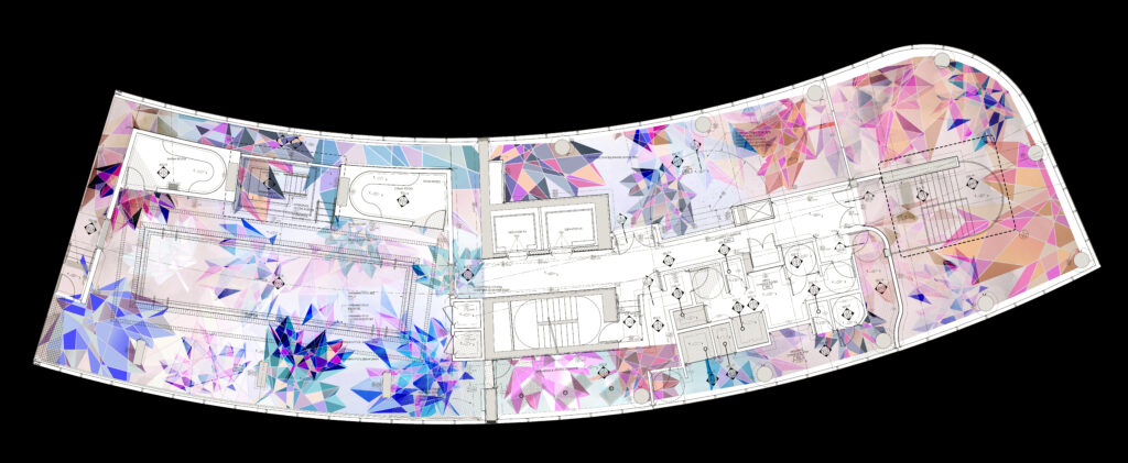
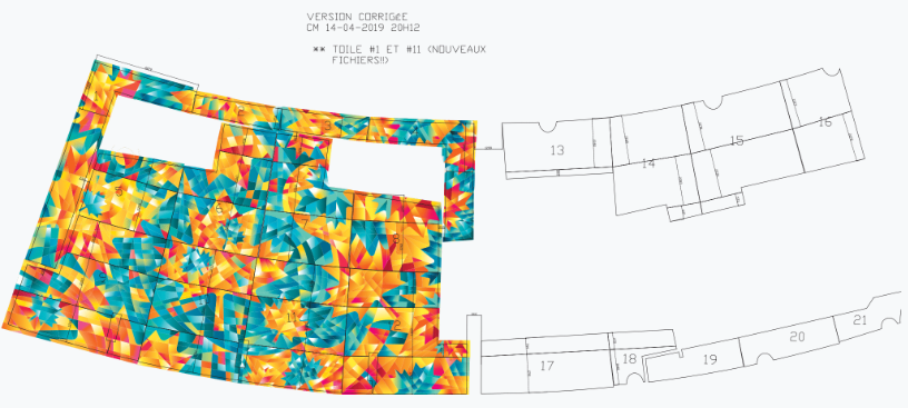
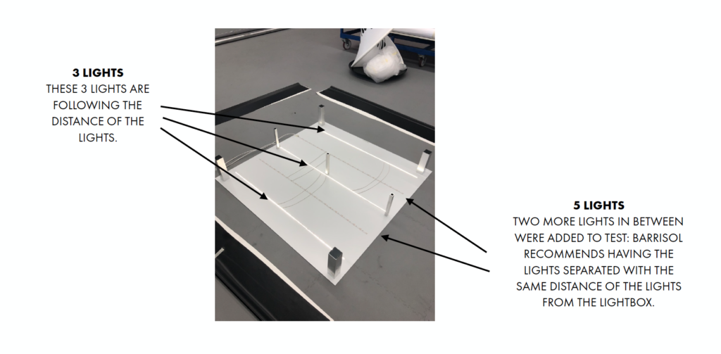
Next was figuring out how to provide consistent lighting throughout the entire ceiling. To properly illuminate this artwork, Nemetz Lighting consultants created a carefully planned grid of lighting found behind the fabric ceiling to ensure the vitality of the space and beauty of the ceiling looks true to vision when it is illuminated. It was important that the lighting was even so all the lighting strips started at the lowest point of the mechanical installations (plumbing and pipes), dropping the ceiling height further.
Lessons Learned
The ARC proved to be one of the most rewarding projects for the LIV Design team. The lengthy design and construction process required our design team to be nimble and open-minded in order to innovate quickly to address challenges and changes as they arose.
Some other lessons we learned throughout the course of this project:
Keep lines of communication open with all stakeholders
Architects, engineers and construction crew to ensure design vision is executed or revised as necessary. We held bi-weekly meetings to ensure we were all on the same page.
Be mindful that prospective buyers’ tastes vary wildly.
- Create a range of interiors
- Avoid bold colours and opt for understated colour palettes instead to ensure interior aesthetic lasts the test of time.
Choose for Durability
When selecting furniture for common areas, durability must be a key consideration when choosing upholstery and finishes.
Think outside the box
The building’s curves required unique and challenging customizations to carpets and illuminated ceilings including the custom ceiling installation. LIV gleaned alot about the distance needed between the ceiling membrane and the light fixture(s) for even illumination.
When creating the maple leaf ceiling for the amenity floor, LIV learned we had to mix a lot of colors in order to achieve a white light and not cast a specific pool of color from the ceiling (i.e. large patches of blue or red etc.) over the floor, pool or pool deck.
Natural Light is the Best Light
Well, we knew this all along but it was emphasized at The ARC. The over-sized windows in all the common areas ensure residents are energized and inspired whether they are working out, socializing or simply relaxing in these spaces.
Stay tuned for the next article in our Design Deconstructed series and subscribe to the LIV Design Newsletter here.
Want to see more from LIV Design? Read some of our latest articles:
IDS Vancouver 2019 VIP Lounge (designed by LIV)

