“It’s a color that anticipates what’s going to happen next. What’s the future going to bring as we move into the evening hours?”
Laurie Pressman, VP, Pantone Color Institute
As the sun sets on 2019, and night falls on another decade, what better way to kick things off than with a colour that leaves the future wide open, brimming with possibility and open to your own design – Pantone Classic Blue 19-4052 .
Think back to 1999 when Y2K uncertainty prevailed, the Pantone Color was Cerulean blue and now again, a decade later, the colour institute has opted for another shade of blue to welcome 2020 and quell a similar sense of anxiety pervading the global zeitgeist. As we witness instability around the world, we yearn, collectively, for reassurance and comfort. Classic Blue was selected for precisely this reason. It is familiar and a universal favourite – stability and comfort epitomized. Like the sky at dusk, this blue is dependable on the one hand but sufficiently mysterious on the other. Bravo Pantone for choosing a classic.
LIV has the Blues
The LIV design team has a longstanding relationship with blue in all its incarnations and applauds this choice. We look forward to seeing how a variety of industries from printing and graphic design, to fashion and interior design will interpret this colour in their work. Below are some examples of how to incorporate this year’s colour into your environment.
Blue Upholstery
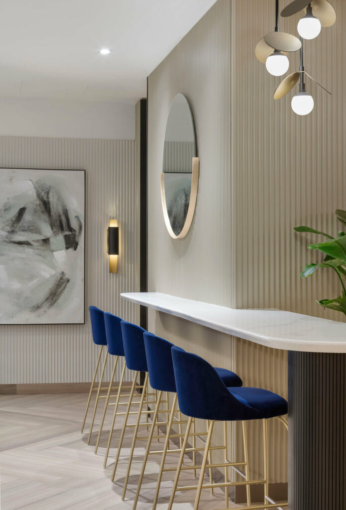
At T&Co within the Westin Bayshore Hotel, we designed custom bar stools upholstered in a sumptuous classic blue velvet, complemented by elegant, brushed gold legs. Elegant and seductive, they invite you to stay seated for your cup of coffee.
Consider blue upholstery or pillows to update the look and feel of any space.
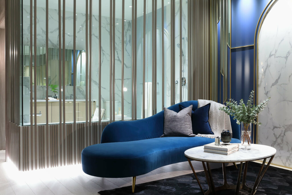
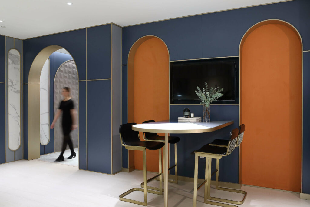
In our Surrey Presentation Centre, contrasting hues of blue and orange invite and welcome guests to experience the interiors of an expansive residential project. The design needed to amplify the appearance of a compact corner and convey a sense of luxury and space to attract visitors. The continuous blue hues created a cohesive experience as guests travelled from room to room.
Paint it Blue
Paint manufacturer, Behr, describes their paint colour, Blueprint, as “warmer than denim and softer than navy”. To us, this is an accurate description of Pantone’s Classic Blue. And, if you are looking for a surefire way to transform a room, consider adding a touch of blue to your walls. The colour adds depth and drama that works well in contemporary and more traditional spaces. It evokes clarity and purity and is both soothing and remarkably neutral.
This crisp, bright kitchen is beautifully complimented by blue shaker cabinetry painted in Farrow & Ball’s Hague Blue, elegant brass fixtures and exposed shelving. The result is a warm, inviting space that would please any home chef.
Blue Home Accents
Evocative of the night sky, this perfect primary colour is popping up in smaller ways for the home. Ligne Roset’s Ploum Settee is ultra soft and seductive in a deeply textured blue while Arne Jacobesen’s Series 7™ Chair in AI Blue is the perfect choice for the office or kitchen; it conveys some gravitas without black’s severity.
For a more delicate touch of blue, the iconic Arne Jacobsen’s AJ lamp collection designed for the SAS Royal Hotel (Radisson Blu) in Copenhagen in 1960 looks remarkably current as does one of our favourites, Clara von Zweigbergk hexagonal Kaleido Tray – the perfect catch-all for kitchen or vanity.
We also love the blue version of the classic Iitala glassware named “Kastehelmi” or dewdrop, originally designed by Oiva Toikka in 1964 or the iconic Alvar Aalto vase in the same hue – created by the design legend in 1936 and inspired by waves.
Classic Blue is a perennial favourite. To hearken the new decade, find a way to incorporate this clean, evocative blue into your life and take note and celebrate its presence in the natural world. This year, Pantone picked perfectly – this colour is a stunner.
Cover image source: Unsplash

