met·a·mor·pho·sis | medəˈmôrfəsəs
A change of the form or nature of a thing or person into a completely different one, by natural or supernatural means.
Oxford English Dictionary
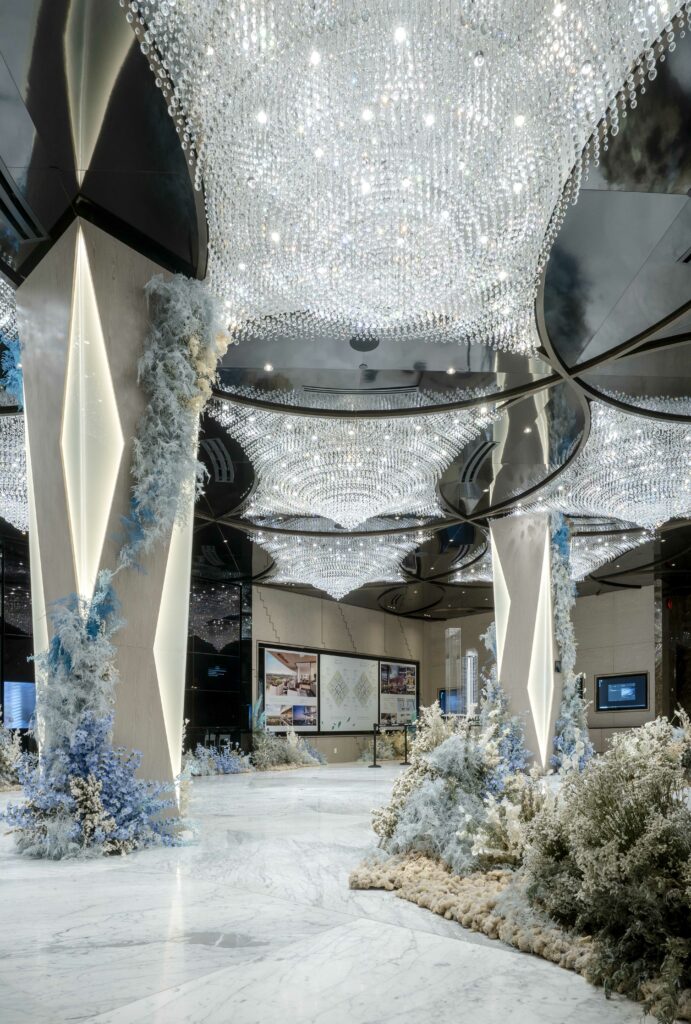
A striking transformation took place at the Burnaby Presentation Centre — one that combines nature and wellness with technology in unexpected ways.
LIV Design’s Interior Designer Deanna Mok shared her thoughts and inspiration behind the work that went into this unique presentation centre and its recent floral metamorphosis.
About the Burnaby Presentation Centre
The Burnaby Presentation Centre, which showcases a display suite for future imagined living at Concord Metrotown, emerged from a cocoon.
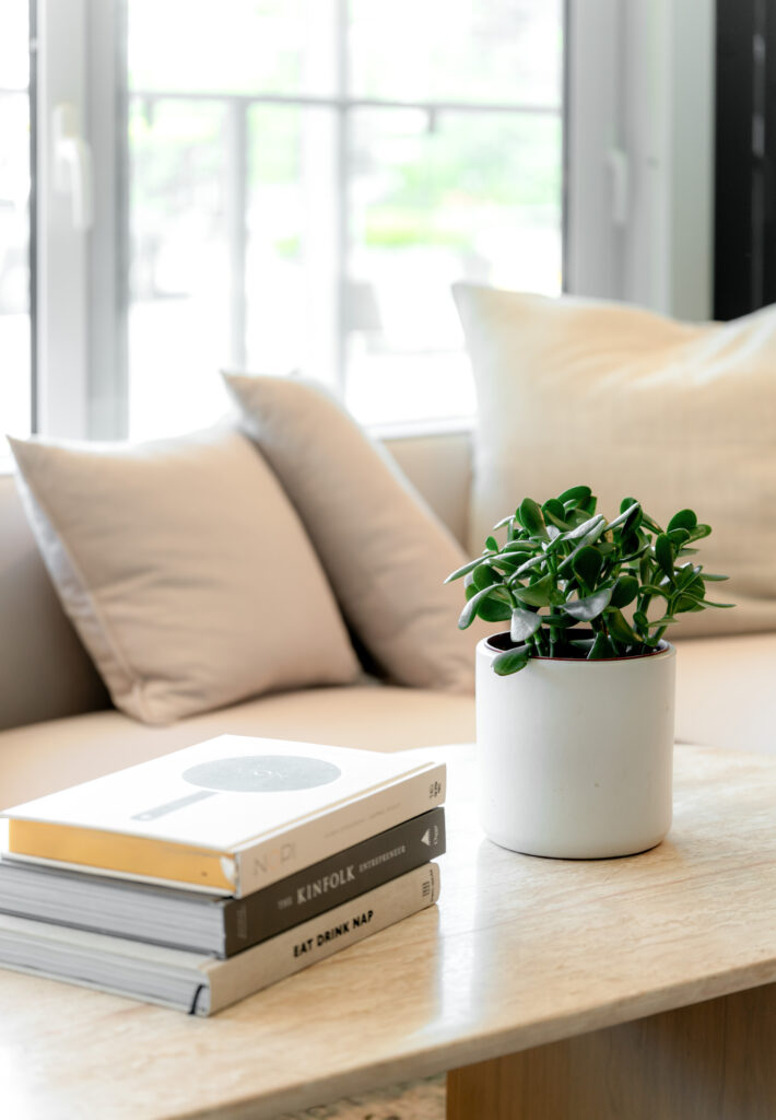
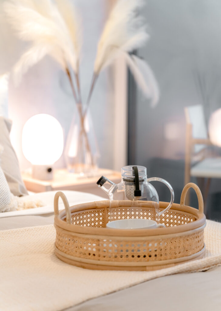
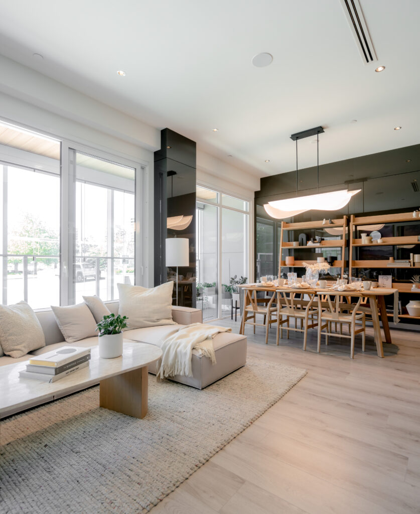
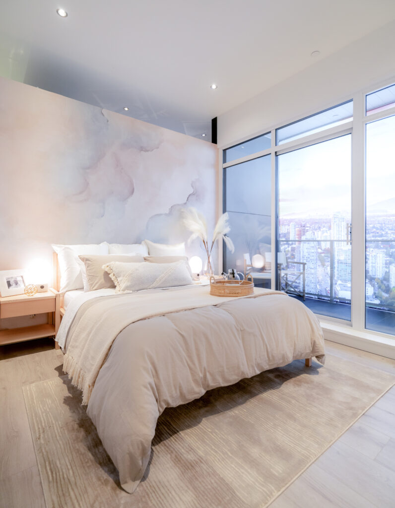
Formerly a presentation centre for the Brentwood development, Deanna said that the LIV Design Studio did a little FF&E light renovation — that’s furniture, fixture, and equipment. “We added florals, and we changed all the furniture and the accessories in the display suite,” she said.
Design concept & inspiration
I would say the design is reflective to the current times and the lifestyle we need now, and at the same time, it’s still timeless…
Deanna Mok
The design of the Concord Metrotown development was heavily influenced by the modern realities of life in a COVID-19-era and beyond.
The pandemic and its coinciding cultural shift to a work-from-home lifestyle influenced changes to Concord’s Suite Standards, introducing Concord’s new Biospace virus mitigation approach.
This approach included making oversized patios in suites that were enclosable — creating indoor-outdoor spaces that could be rearranged to create different work-from-home environments.
The team incorporated countless technologies to improve the health and safety of residents. According to Deanna, all this technology helping with wellness and safety was the reason why they chose the striking shade of AI Aqua for the presentation centre. “I think we tried to capture that into Metrotown with the florals,” she said.
Floral Installation
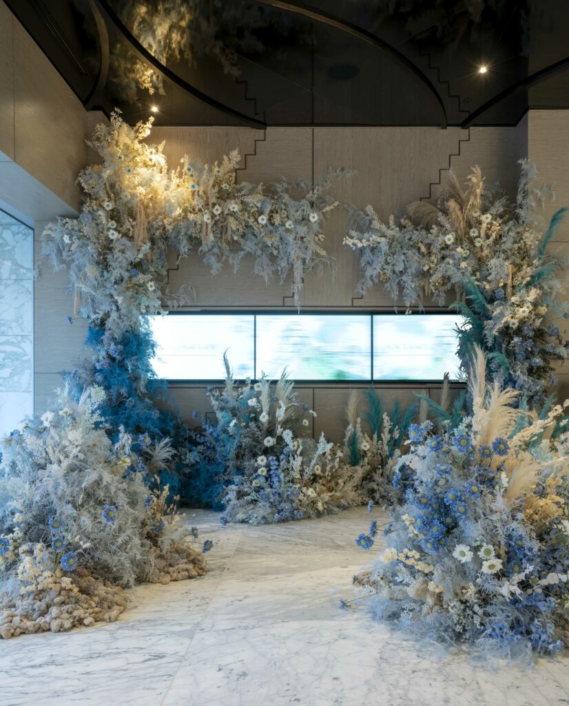
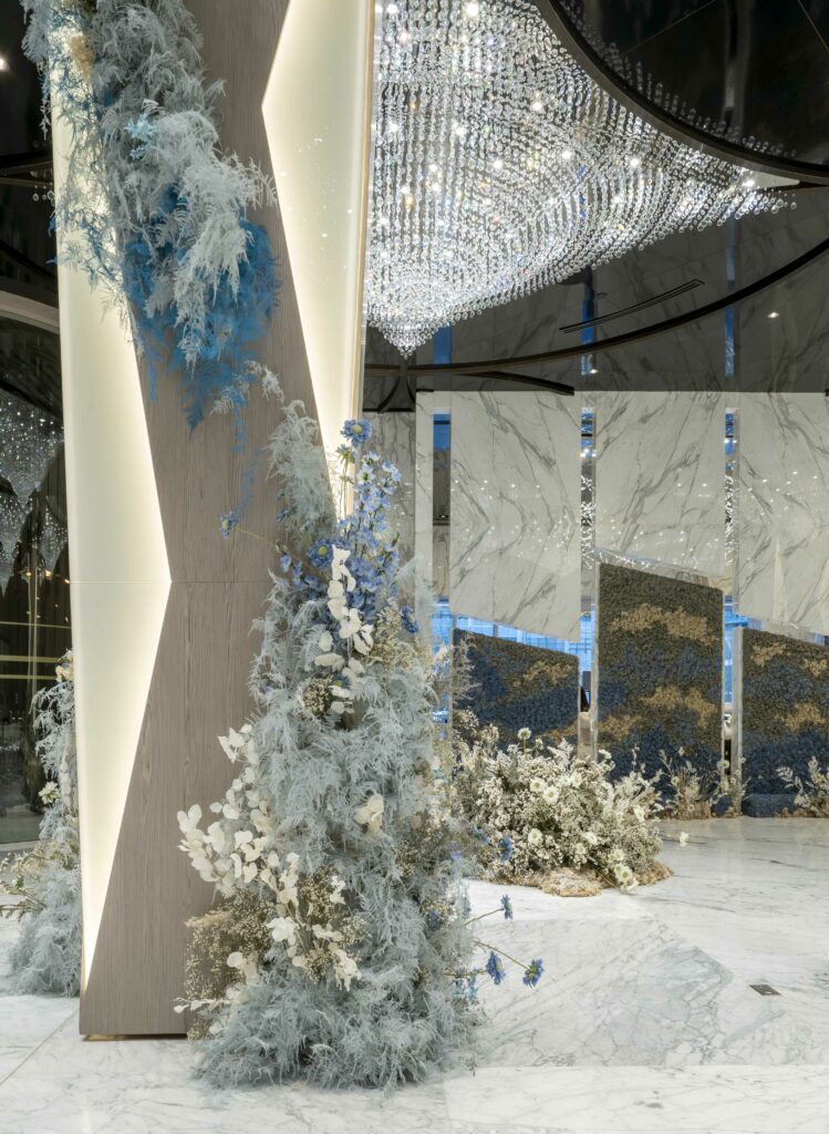
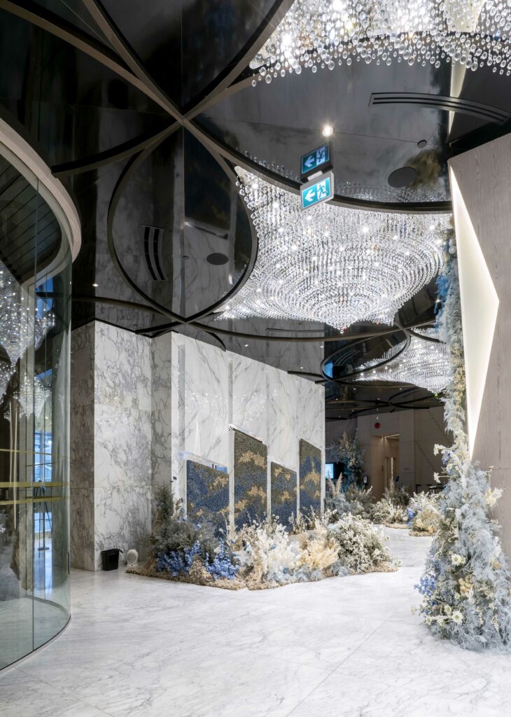
We wanted to make it adventurous, because everyone gets excited to go into a presentation centre, so we tried to create little bubbles of florals within the space.
Deanna Mok
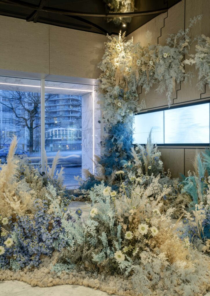
To enter the lobby of the Burnaby Presentation Centre is to walk into a dreamy floral wonderland. “The florals are more concentrated onto the window side of the presentation centre, the side that’s open to the parking and street area to capture people’s attention as they walk by,” explained Deanna.
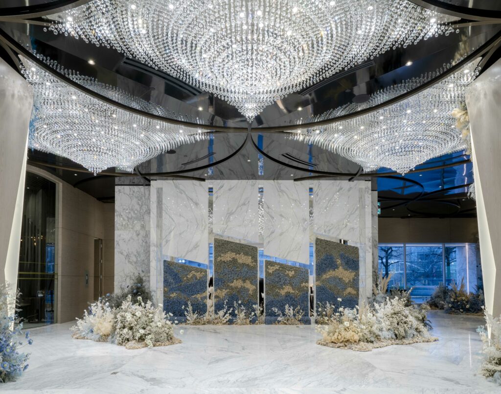
“The concept behind the florals was to reflect technology and wellness living combined with the AI Aqua,” said Deanna.
Featuring a profusion of dried flowers and botanicals from HANA by Celsia, the result is a space that’s as Instagrammable as it is inspiring.
AI (Artificial Intelligence) Aqua is the vivid foundation for the colour scheme and it’s accompanied by complementary pastel hues throughout the presentation centre.
LIV Design Studio is pleased to offer 15% off your plant or floral order at Celsia Floral Shop and HANA by Celsia. Simply use the promo code LIVHOLIDAY15 to redeem.
FF&E: finishing touches
The final stage when we style it with accessories, that’s always the funnest because everything’s done and we’re just adding the sprinkles on top of the cake.
Deanna Mok
Reimagining the presentation centre
You’re trying to put someone’s dream into a display suite,
Deanna Mok
When designing a presentation centre, you must appeal to a wide spectrum of tastes while also transforming an ordinary space into a compelling story of future lives lived in the new development.
As part of our effort to have a wide appeal, the design at once takes into consideration the concerns of a world amidst a global pandemic while also being a timeless space.
Ergo, the challenge for our design team was to adapt the preexisting presentation centre and bring it up to date — the Burnaby Presentation Centre was about five years old at that point.
“We’re trying to capture the new pandemic wellness lifestyle, so we’re trying to fit the existing hard structure of the existing presentation centre and match it with FF&E that matches our new concept,” said Deanna, who cohesively merged the old and new together.
In a way, it’s kind of not really how you would really live but how you dream you would live…
Deanna Mok
Visually-Led Design
-
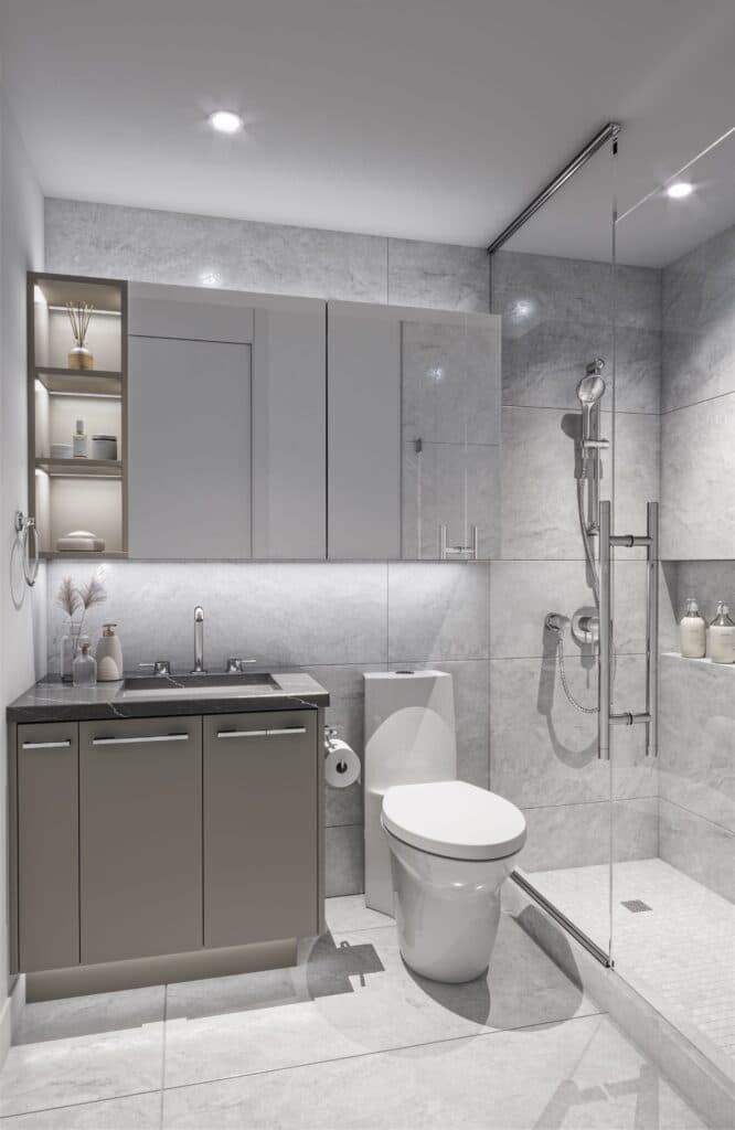
3D rendering -
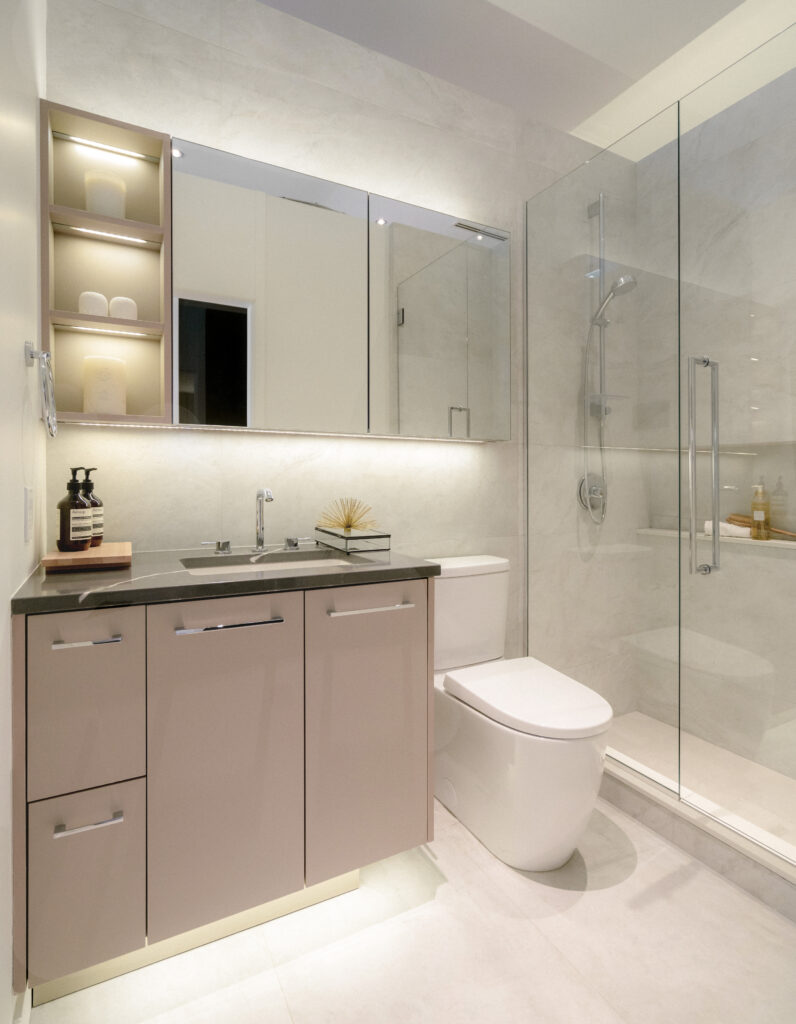
Final project
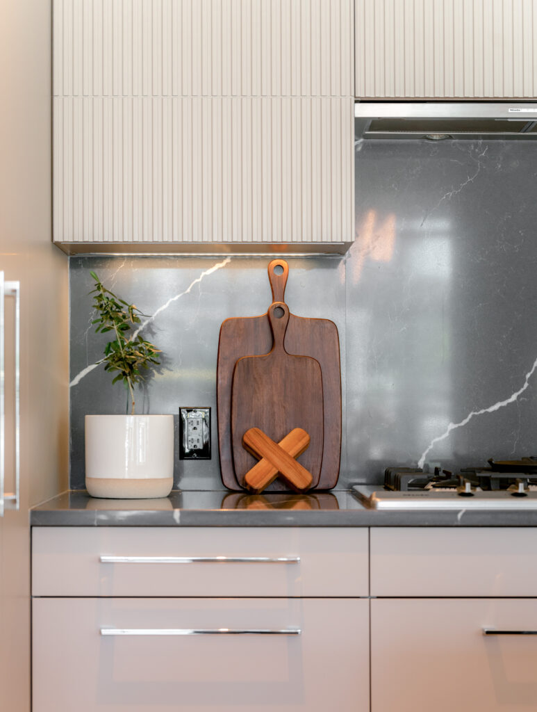
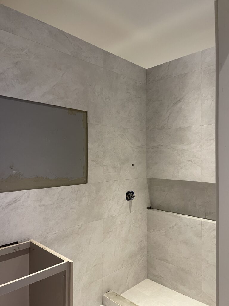
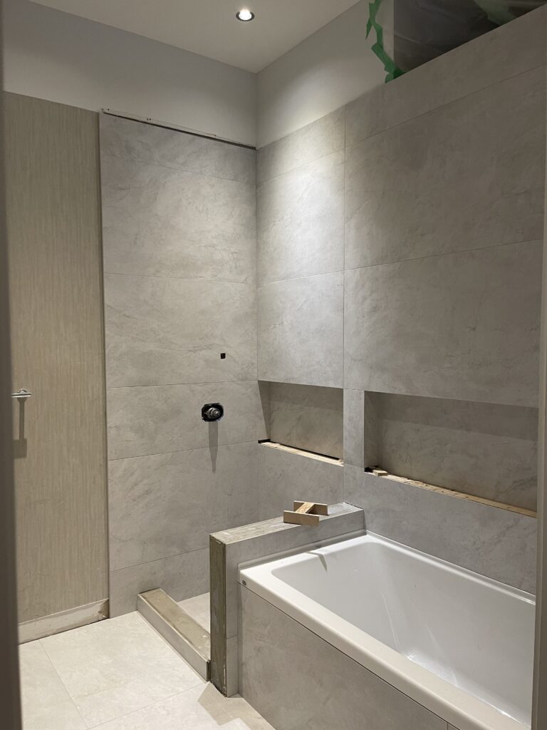
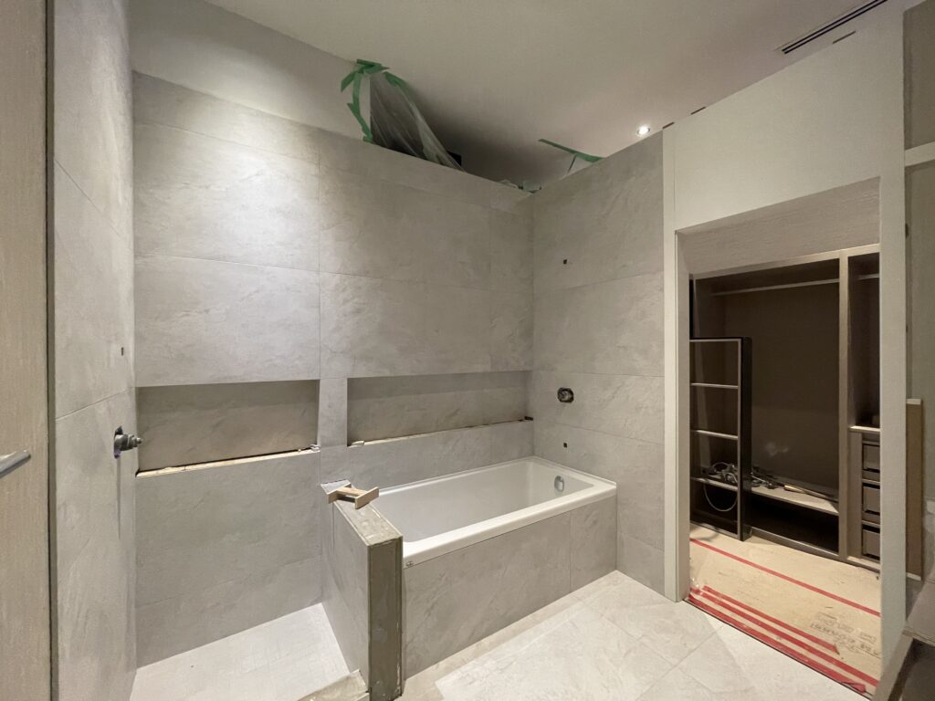
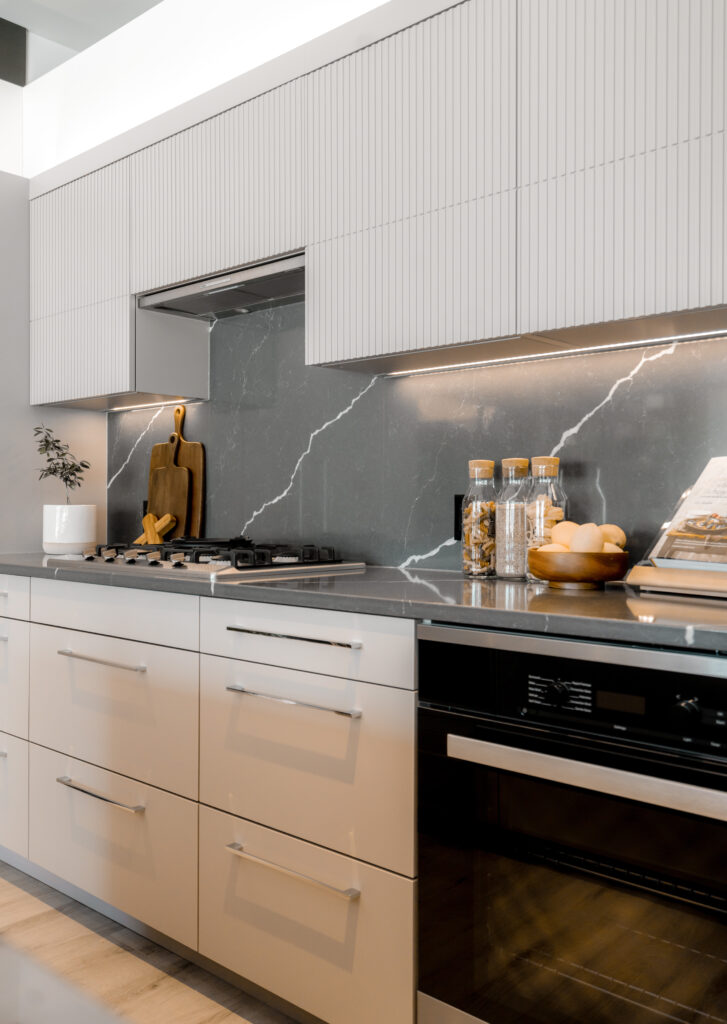
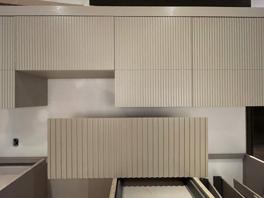
Deanna used LIV Design’s Visually-Led Design (VLD) design process in the design of the Burnaby Presentation Centre’s display suite kitchen and bathroom.
“The kitchen is newly designed, so we rendered that to get approval,” said Deanna. The entire team at LIV Design uses VLD as a foundation, using technology to facilitate enhanced and accelerated communication.
“When you’re trying to get approval and you have 2D drawings and 3D…they understand it quicker and better and faster — so it speeds up the communication process,” said Deanna.
Final reflections
At LIV Design Studio, when we breathe life into a presentation centre through culture, technology, and design — we see it as a chance to bring a daydream into the 3D world.
Encouraging the public to engage with the space and to imagine themselves living in the imagined presentation suite flexes our team’s creativity in new and wondrous ways and we welcome the next opportunity to do so.

