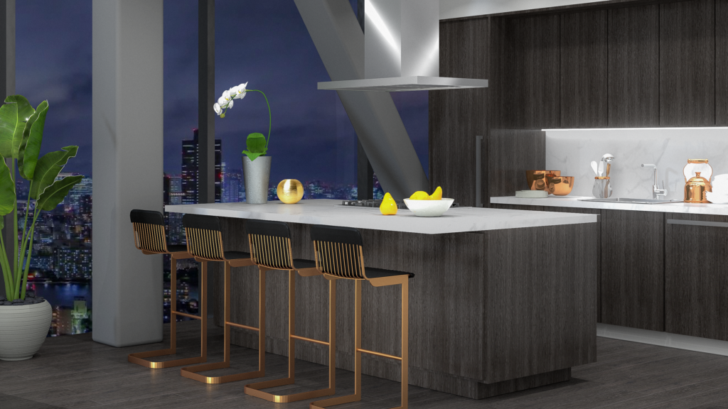
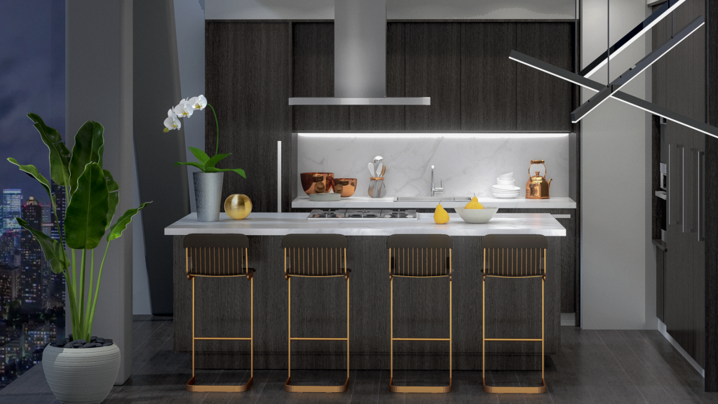
Bringing LIV Design’s vision unequivocally into the very skyline of Toronto, the Bridge Suites at Concord Adex in Toronto are a crown jewel in our design portfolio and amongst the skyscrapers of the city.
Dickson Chu, one of LIV Design’s Senior Interior Designers, shared his experience working on the project and helped to deconstruct one of the most iconic suites in Toronto’s history.
About the Bridge Suites
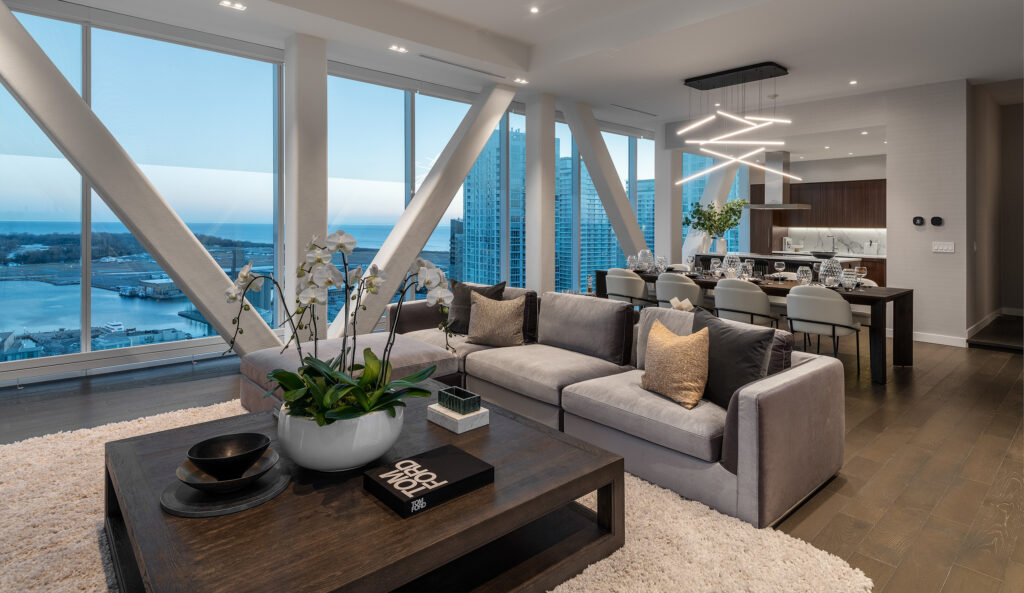
The bridge suites are a breathtaking connection between two towers. It was originally completed back in 2010, prior to the naissance of LIV Design.
It sat as an empty concrete shell, bare, without even a scrap of drywall, for almost 10 years.
Then, in 2019, the decision was made to renovate and finalize the property so it could go to market. “Then, Olivia came to us and said, maybe now’s the time to bring the project to life again,” said Chu. “We got the mission: to complete the design.”
Design concept & inspiration
The staircase
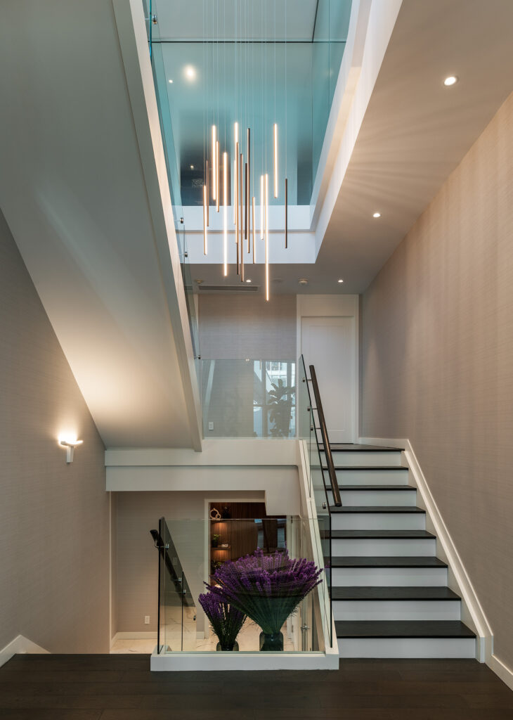
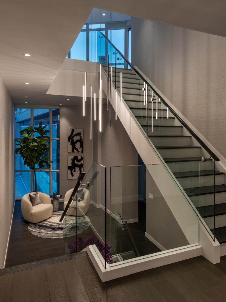
One of Chu’s highlights of the project is the crisp glass staircase. Originally, the client was interested in implementing a wood railing.
When our team showed them what was possible by switching to a glass design, they agreed — this was the right direction that would elevate the entire suite.
This is a multi-million dollar penthouse, we should definitely try to push the boundary further
Dickson Chu, Senior Interior Designer at LIV Design
“For this penthouse, we tried to push it a little further with a glass railing to give it that luxury touch and upgrade,” said Chu. “Now, when you look back in the project, the staircase is just stunning.”
Project challenges
Since the building was finalized well before LIV Design was brought on board, a unique challenge for our designers was working around the structure itself.
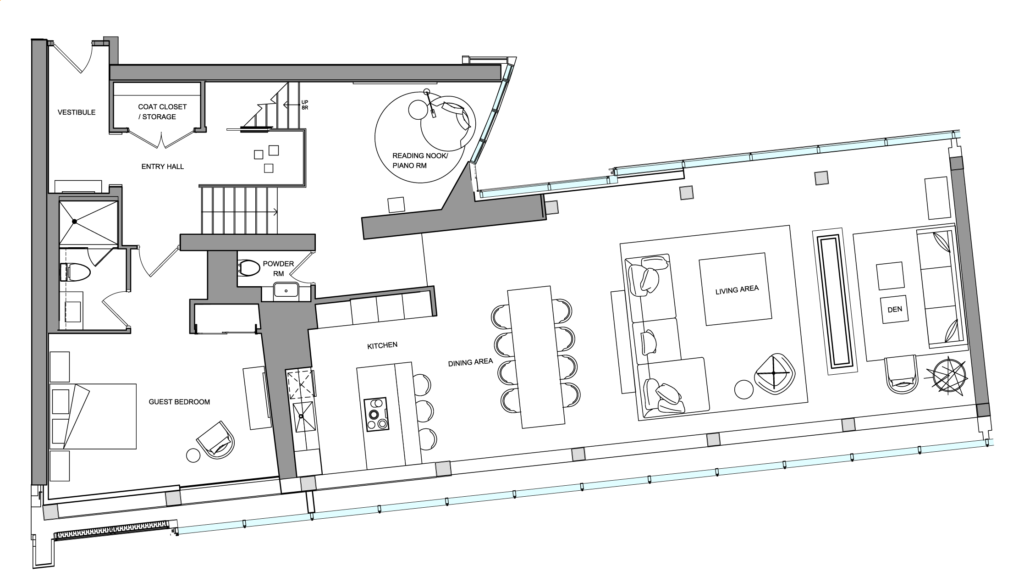
We inherited concrete columns and structural walls, “that kind of element is already inside that we cannot take out, so we have to play around it,” said Chu, who was tasked with finding the best layout with all the given inherited elements.
And while all of this could be seen as a challenge, for our team it was more of an exciting opportunity. Exploring a fixed structure gave the team ideas that they never would have dreamed of if they had started from a blank slate. “It just kind of pushed our imagination design mindset further, it pushed the limit a little bit more,” said Chu.
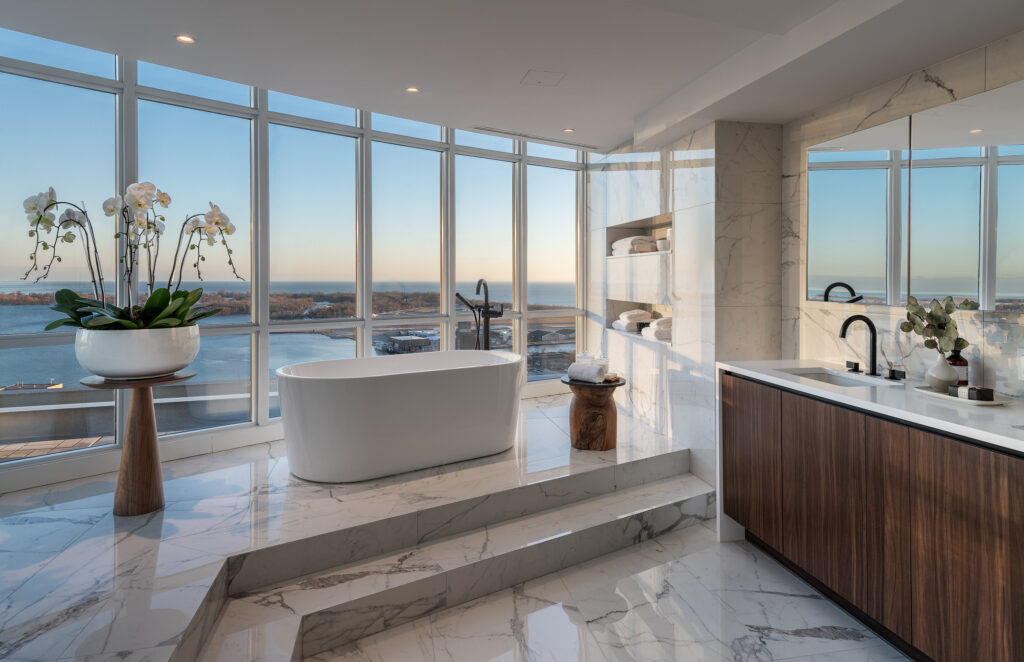
An example of the team’s creativity in play is evidenced in the master bathroom ensuite, where the positioning of concrete slabs presented fresh design opportunities.
“We cannot take it out or push it out, that’s how it was built, so we have to think how can we incorporate that into our design?” said Chu of the awkward arrangement. The solution:
“Let’s add a two-step staircase to give definition and give us a chance to play with the layers.”
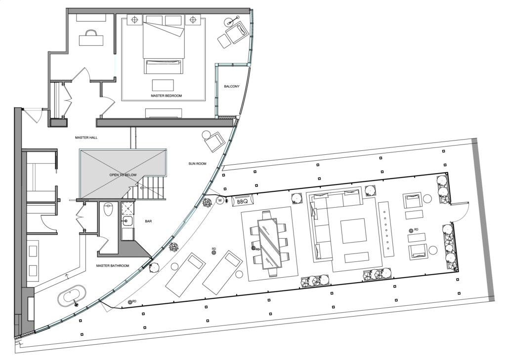
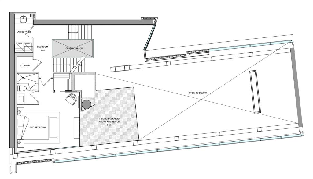
Suite 3306 at Concord Apex
Three levels
Suite area: 4,168 square feet
Terrace/balcony: 823 square feet
“This project was unlike any other due to the true uniqueness of the space,” said Olivia Lam, LIV Design Studio’s Principal. “The architecture is so unique that creating the right balance of program and timelessness was a welcome challenge.”
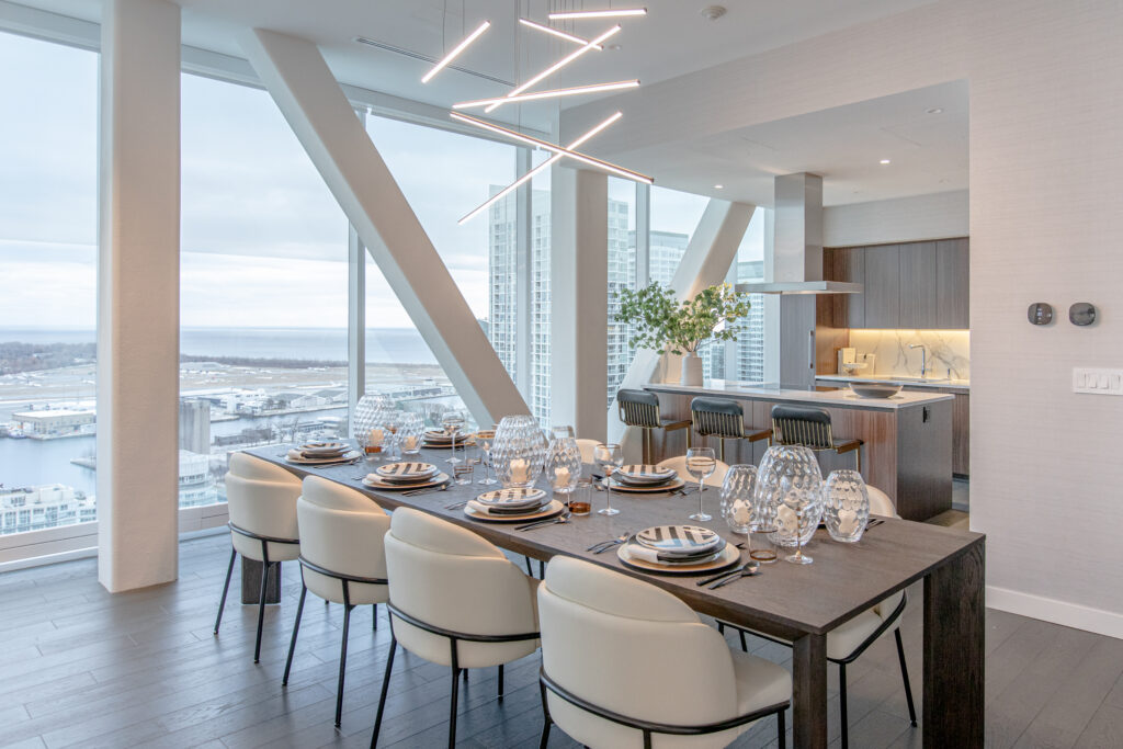
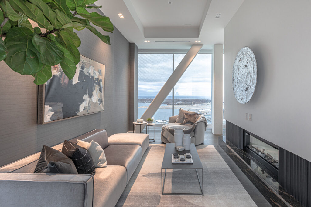
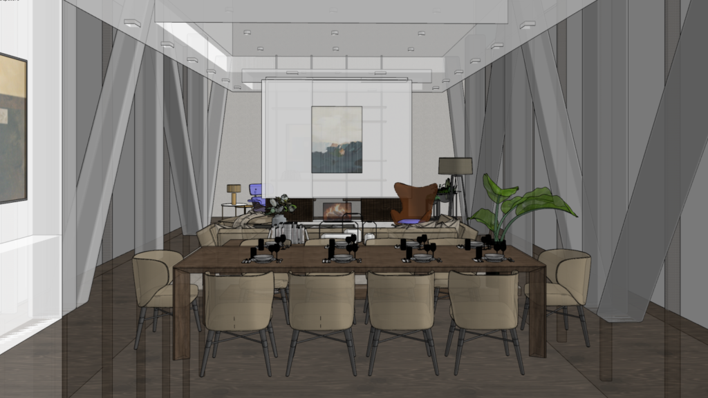
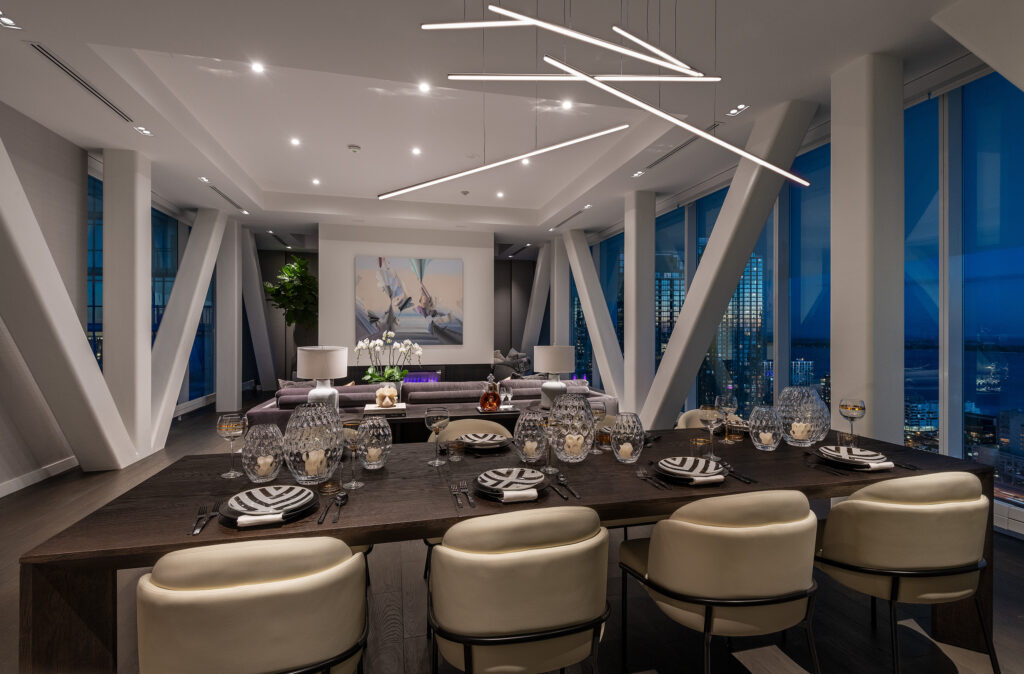
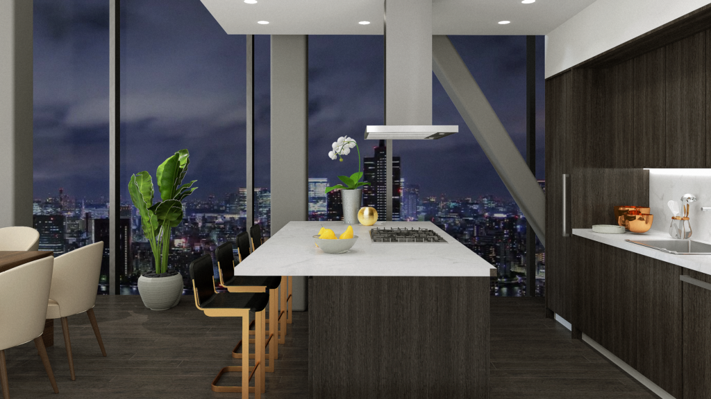
The suite is full of angled trusses. “It could be a bad thing or a good thing,” said Chu, “We first thought of maybe covering it with drywall so you couldn’t see the structure, but then, later on, we thought if we cover it with drywall then we would block quite a bit of the natural light.”
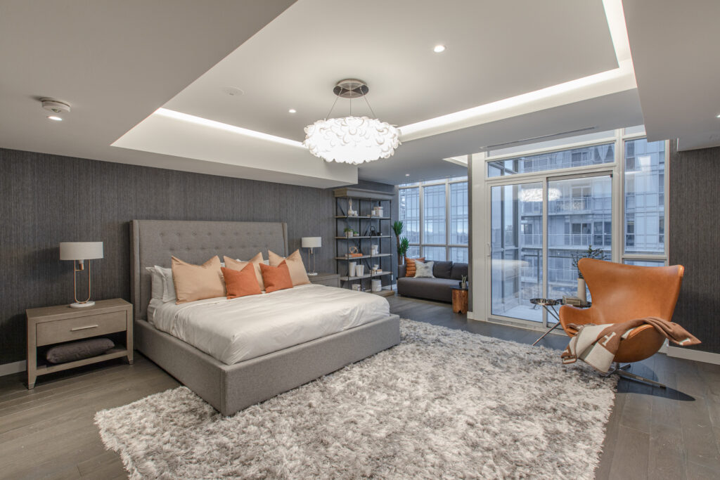
Committed to fully articulating the suite’s open concept, what was the most striking feature of the project was also one of its greatest challenges. “The view is phenomenal,” said Chu. “We wanted to make sure that we utilize as much natural light as possible.”
With the abundance of natural light and its incomparable views, the LIV Design team knew they needed to keep the spaces as open as possible on both sides. Instead of blocking windows with drywall, they decided to keep the trusses in the design, painted white to create a unified look as it fades into conformity with the white walls and ceilings.
Visually-led design
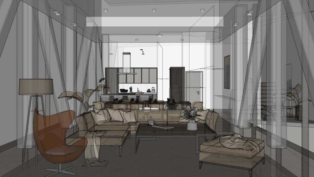
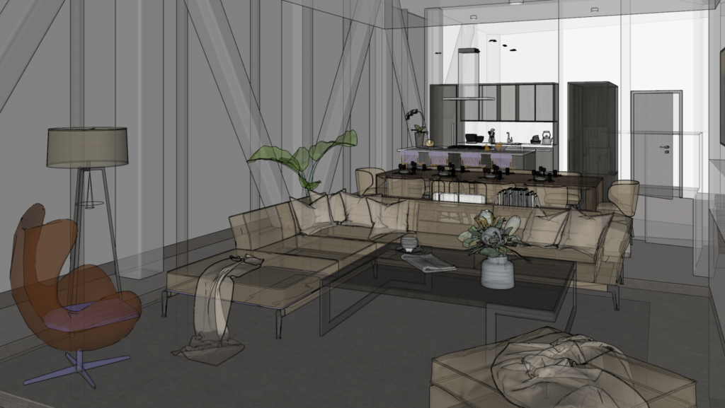
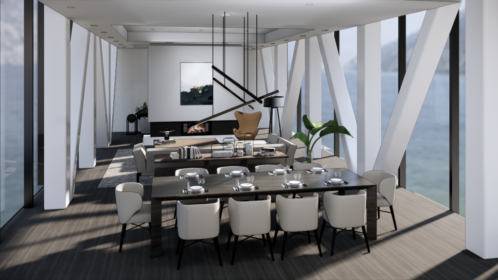
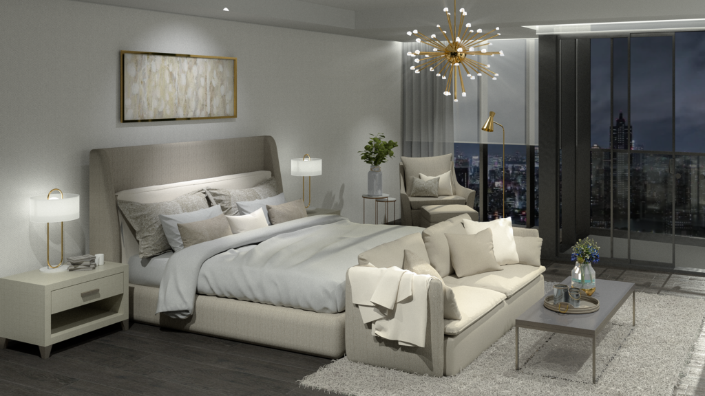
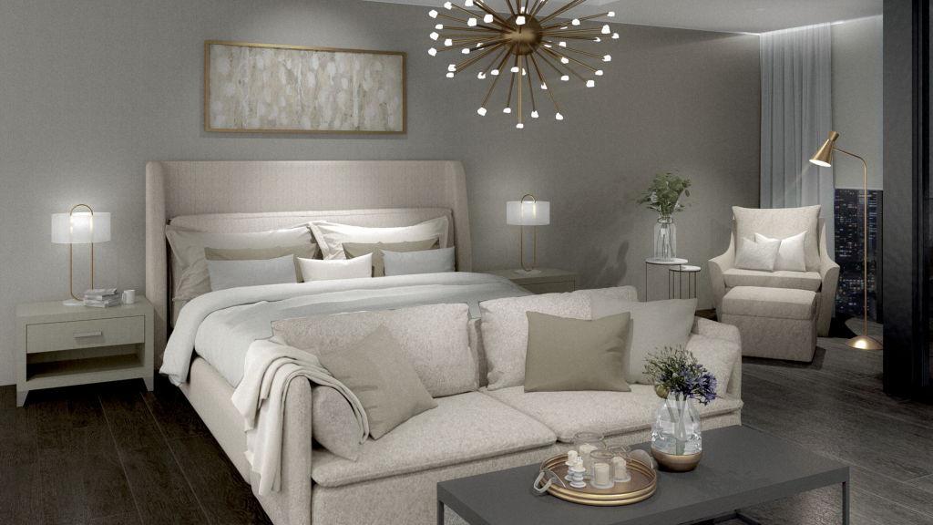
LIV Design Studio’s Visually-Led Design (VLD) approach embraces rendering technology throughout the design process and leads to enhanced communication while voicing a cohesive vision.
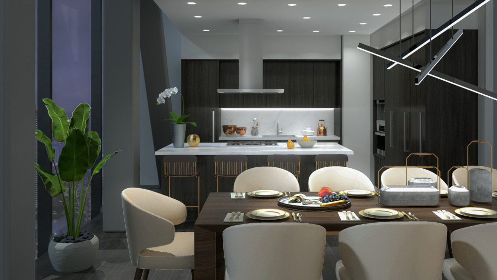
“We try to do rendering for every project so that everyone has a full understanding before we start the renovation. Anything that needs to be changed or revised? Now is the time,” said Chu.
For this project, our rendering process helped an entire team to understand the final look of the project. Renderings are completed to showcase the unit filled with perfect furniture and the ideal accessories to elevate the home.
“…It gives you that final touch, that real-life feeling, like you can imagine you can live inside,” said Chu.
“Many of us, when we live in a space, accessories is one of the key factors that will affect how a home looks and feels, like greenery and plants, so we throw all of that in the rendering as well to help the clients have a better understanding.”
LIV elements in the Bridge Suites
Basically, the whole concept for this unit is to keep it modern and give it that luxury feeling but not too over-the-top…we want to keep it simple and modern.
Dickson Chu, Senior Interior Designer at LIV Design
While terms like modern and contemporary don’t begin to describe the symphony of style encapsulated in this suite, above all, the design speaks to modern sensibilities with a focus on fewer details and more quality materials. “We don’t want to over-design, we want to keep that luxury level,” said Chu. said.
One of the most quintessential ways you can clearly see LIV Design in this space is through our intense focus on materials. It’s not just stone that you’ll find in this home, but rather, a myriad of marble.
Additionally, our studio’s commitment to the marriage between technology and design is evidenced in the suite’s integrated lighting features and the master-planned staircase with a sleek glass railing.
By leaning into the challenges of layout and structure, LIV has once again unveiled a finished project that exudes elegance and luxury with a distinctly welcoming feel. And this one comes with a view.

