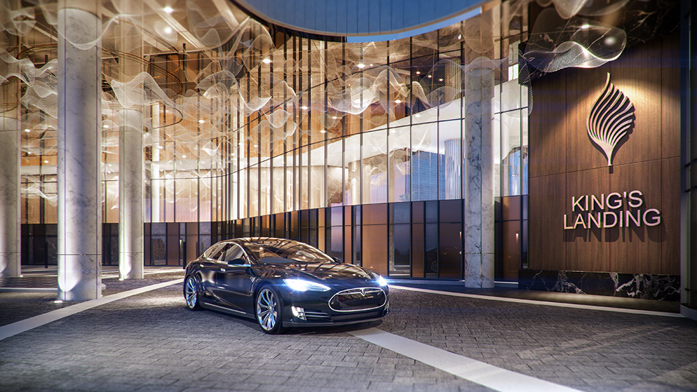
King’s Landing is one of the latest condo developments situated in North York, Toronto, as part of the 45-acre Concord Park Place – aimed to transform the North York landscape.
The Client
Concord Pacific is Canada’s largest community builder – dedicated to pioneering the development of progressive and well-rounded communities that work for Canadians. One of their latest projects includes King’s Landing in North York, Toronto.
Design Brief
The challenge presented to us by the client was to demonstrate to potential buyers how each floor plan could be optimized and transformed into a beautiful living space. One particular plan was more challenging – it was long and narrow, and potential buyers were struggling to see it as a livable/workable space. The LIV Design team was tasked with illustrating its versatility in an innovative and attractive way; to show how these unique spaces could work for everyone.
Using the beautiful kitchen and bathrooms as anchors, we set out to inspire and illustrate to buyers how to further decorate and furnish the suite using some of our favourite options – signature furniture, finishes, lighting, and custom cabinetry design. As a result, 2 different design concepts were created:
- Option 1 – Sophisticated and timeless
- Option 2 – Vibrant, and retro-modern
Challenges

- The long and narrow layout was the main challenge. By developing two different design concepts with endless storage opportunities, buyers were more easily able to imagine how to live and utilize the space.
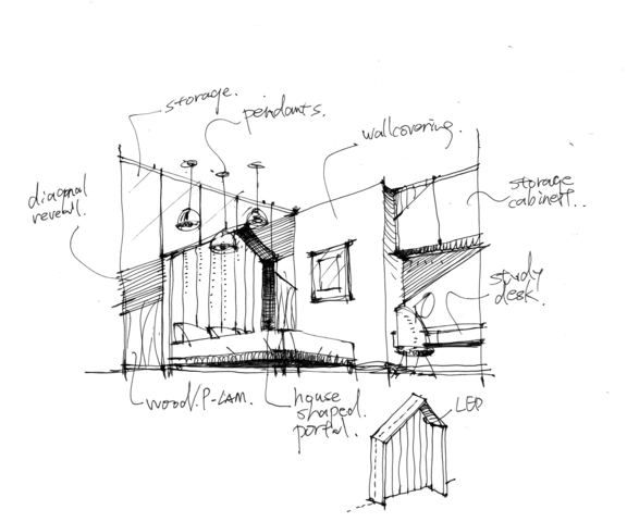
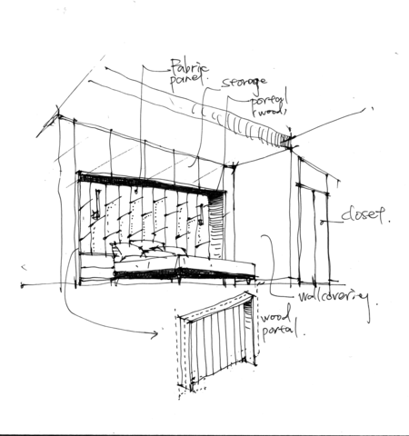
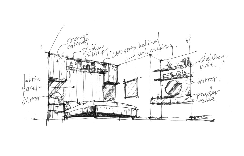
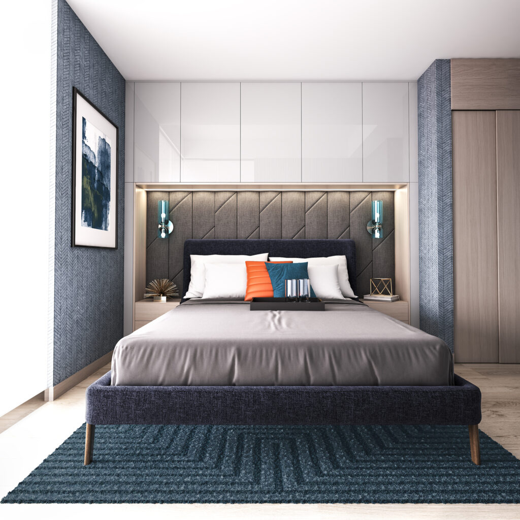
- In addition to the layout, limited storage space posed another design challenge. Due to the limited width of the living room, petite furniture pieces were specifically chosen. Extra furniture options were eliminated by incorporating built-ins wherever possible. Wall-mounted entertainment units with upper and lower cabinets for storage were specifically designed and constructed. In Option 2, wall-mounted shelving was added above the sofa for extra décor/display surfaces. All bedrooms also featured wall-mounted cabinets around headboards and display shelving above the desk/work space for books and objets d’art.
- Creating uniform lighting and warmth across the floor plan was another challenge due to the extended length of the plan. The high ceiling structure in the centre was strategically utilized to introduce cove lighting to generate a uniform warmth.
Design Concepts
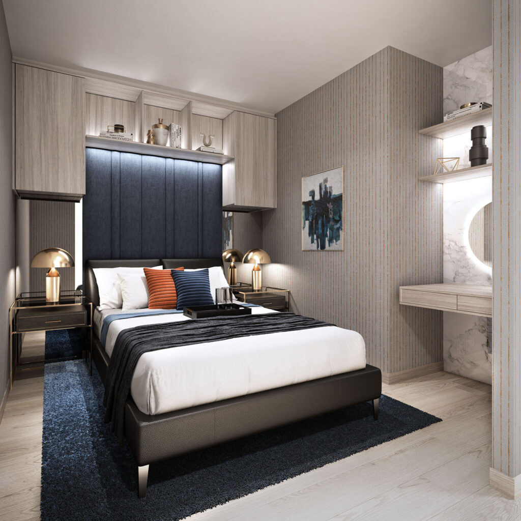
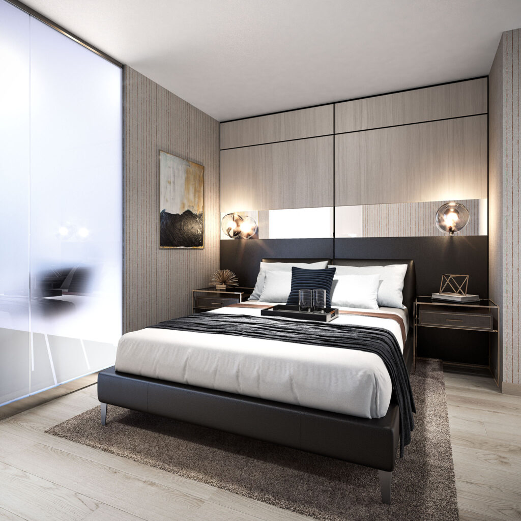
Option 1: Sophisticated & Modern + Timeless
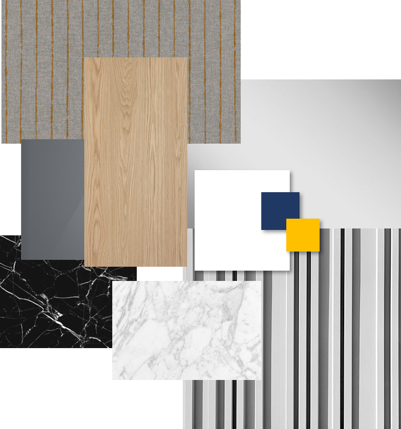
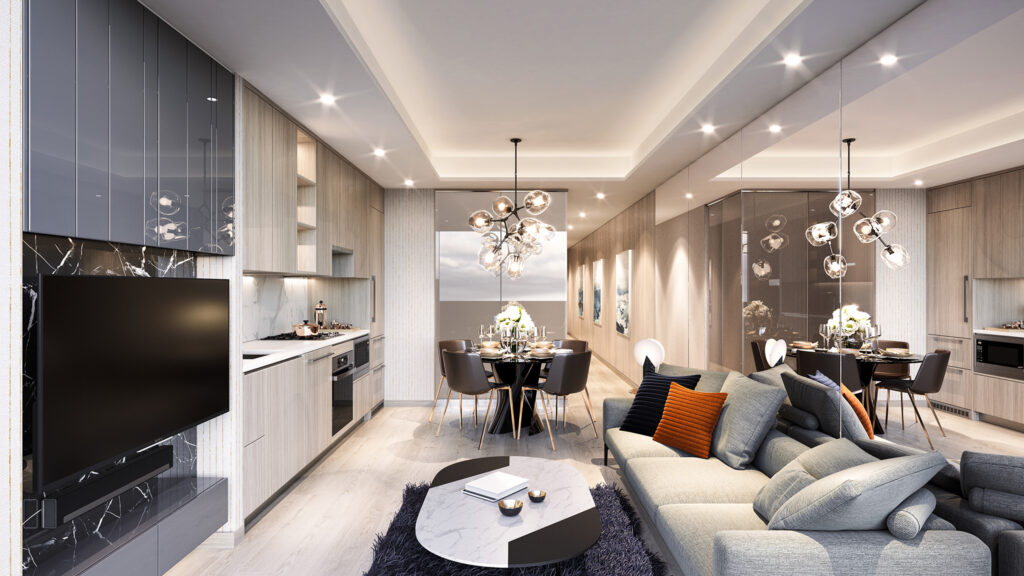
Luxurious, yet relaxed, this design appeals to the professional couple – well educated, discerning, and sophisticated. Incorporating distinctive and powerful design elements like high gloss lacquer panels, sleek black porcelain tiles, and understated bespoke, pinstriped walls, this concept delivers subtle elegance. Warm wood veneers, elegant fabric panels and hot-again smoked mirrors add texture and depth, visually expanding the look and feel of the space.
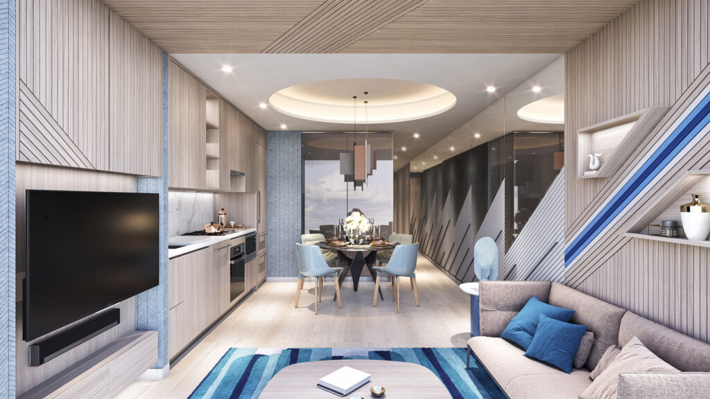
Option 2: Retro-modern & Vibrant
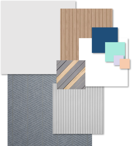
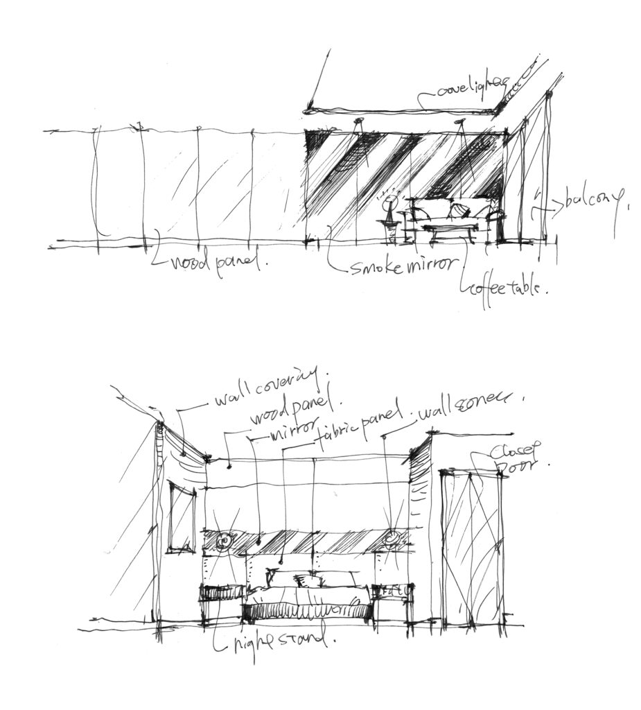
Incorporating a variety of colours, shapes and design, this concept juxtaposes a cool palette with evocative geometric design features to appeal to younger couples looking for a stylish home. A wood portal frame, black fabric panels plus diagonal mirrors and gold-lined wall coverings create a visually dynamic experience that evokes both the future and the past. A herringbone wall structure anchors the dining room while dark blues and greys add a seductive note.
Inspiration
Small space living is a new reality as land becomes more limited and costly while population density grows. The LIV Design team drew inspiration from well-designed small apartments in Europe and Asia, where the square footage for an apartment can be as small as 470 square feet. This means good design is even more important today as we try to optimize areas for comfortable living within tight space parameters. Fully utilizing every square foot, using scaled down furniture and constructing custom, built-in cabinet storage was crucial and effective in maximizing the functionality and feel of King’s Landing interiors. Also, adding mirrors to the walls and custom cove lighting on the ceiling further enhanced the illusion of space.
Colour, Materials and Moodboards
A lot of highly reflective materials were used in order to increase the sense of space. The incorporation of bold colours like orange, blue, and yellow on accessories were added for vibrancy and modernism. For example, mirrors installed on the long, continuous wall connecting the suite entry to the living room help visually widen the overall space. In option 2, the objective of further enhancing the illusion of space in the floor plan was taken to the next level by introducing diagonal lines and graphics to add some playfulness and whimsy to the space.
LIV elements at Kings’ Landing
At LIV, we always pay close attention to 2 key elements – functionality and lighting uniformity. In every design scenario, it is important for LIV to balance aesthetics and functionality to create an inviting, useful space. For example, the long and narrow plan presented a significant challenge as few potential buyers would be able to visualize how to utilize such a space effectively. After we realized our vision for the suite, our work successfully demonstrates to buyers how to achieve the best functionality from the space by selecting the right furniture and material finishes and incorporating smart storage solutions. Also, proper lighting helps create a visually dynamic space. The cove lighting we added to the living room and bedrooms not only acts as ambient lighting, it also enhances the overall mood and immersive experience of the visitor.
Amenity Space
The design of suites complements the building’s amenity spaces. Like many of our other projects, our designers analyze how the community interacts with each other and the environment. King’s landing features 5-star amenities such as a fitness centre and ballroom. Designed for the modern-day residents in the North York region.
-
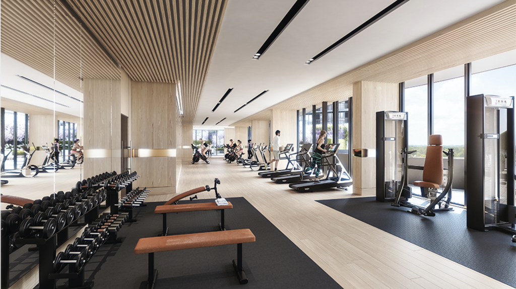
Fitness Centre -
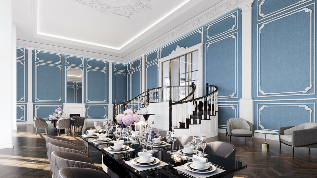
Shared Ballroom
Stay tuned for the next article in our Design Deconstructed series and subscribe to be part of the LIV Design Newsletter here.
Want to see more from LIV Design? Read some of our latest articles:

