Our environments shape the way we experience a space. Architects and designers inherently know that good, intentional design can promote student success both academically and socially and, as we move away from traditional classroom settings to spaces that foster better collaboration and interaction, this is especially true.
The way educational buildings are designed – from the architecture and location, to the classroom layout and collective spaces – hugely influence the human experience in general and learning particularly.
Today we take a closer look at the trends influencing the design of schools and universities around the world.
Emphasis on Common Spaces
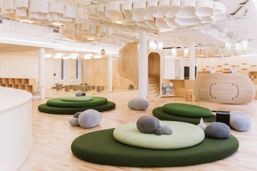
Oftentimes, the most innovative and memorable spaces on campus are collaborative or common spaces. This is partly due to the impressive scale that affords architects more latitude to exercise innovation and creativity but also because this is where students meet to work and socialize, making memories in doing so.
Even within classrooms, architects are encouraging collaboration through open, fluid designs that drastically depart from traditional classrooms lined with bench seating and desks in favour of varied seating/table options that encourage mobility and flexibility. Even small changes, like the introduction of afew standing desks can foster better learning and higher engagement.
In the WeGrow space pictured above, the open concept and variety of design elements and textures encourage young students to interact with their environments. The Bjarke Ingels Group designed this beautiful immersive indoor environment that is both playful and structured – encouraging exploration and introspection. Acoustic clouds, natural materials and neutral colours were chosen to facilitate focused study in a calm environment. While tree houses and modular classrooms promote collaborative learning.
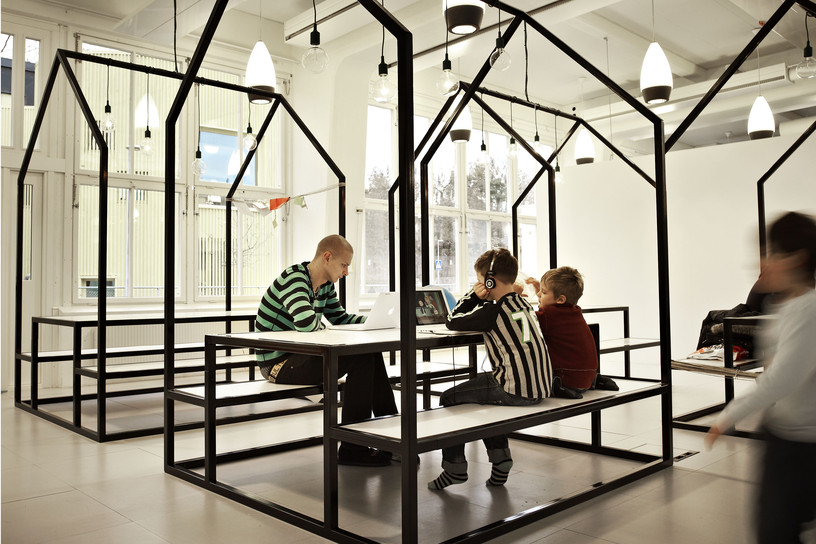
At the experimental Swedish school, Vittra Telefonplan, designers from firm, Rosan Bosch, opted to forego as many walls as possible. The school features furniture, modules, colours and spaces that encourage play and creativity. In place of rows of desks, for example, you’ll find neon-green “sitting islands” and whimsical picnic tables, where students and teachers gather for lessons and collaboration. Cafeteria-style tables on a checkerboard floor for working or eating while some clever interior decorations and fixtures can double as partitions. The intent is to give teachers and students flexible and varied learning environments that suit their individual needs.
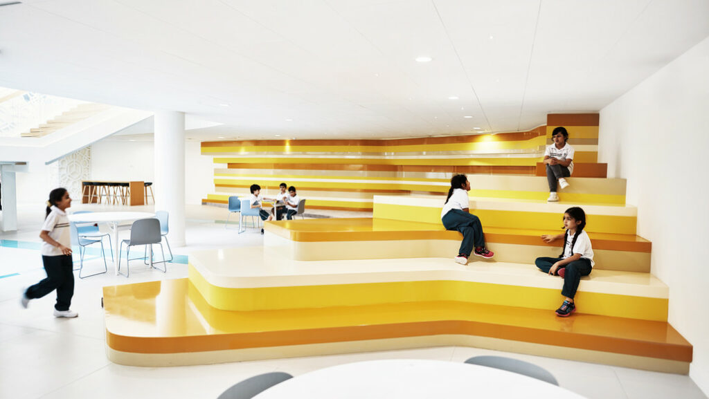
Vittra Telefonplan School, Sweden | Photo: rosanbosch.com
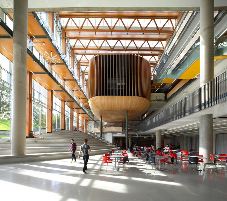
Closer to home, UBC’s new student union building, known as The Nest, provides ample space for students to socialize, eat, meet and host events.
24/7 Living
Like recent work space innovations, there is a broad recognition that people thrive in different settings. Some still need a small space cubicle or office to complete an assignment while others want company, demanding collaborative spaces and natural light. Learning is also more collaborative so common spaces are being designed to accommodate working groups comfortably.
And as more and more hours are spent away from college dorms or other student living areas, public spaces on campus, including libraries, are incorporating the comforts of home into their interior design. These spaces are casual and comfortable – like a living room- with chairs and lounge seating for reading or conversing and long tables for collaborative project work. Students missing home and/or accustomed to café life approve of this trend.
(See our post on Design Forward Co-working Spaces)
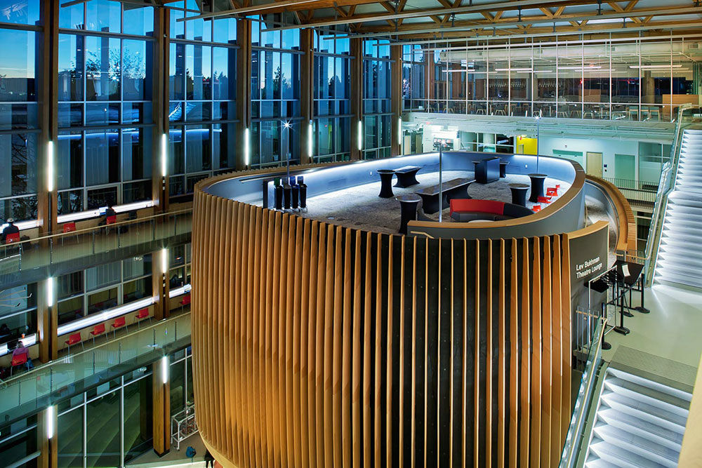
UBC NEST features a variety of seating & eating areas, climbing wall, pub and gym | Photo: wpe.ca
Technology
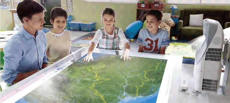
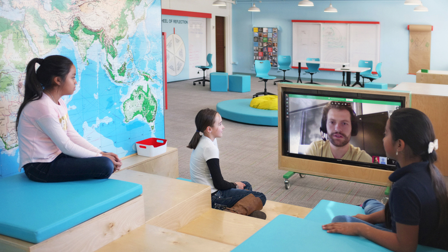
The way today’s students learn demands a new type of learning environment. As digital natives, students fully expect technology to be an integral part of their educational experience so designers are taking this into account when approaching classroom design. Interactive classroom environments integrate technology in ways that elevate the learning experience, encourage teacher interaction, better student participation and group learning. For example, having screens at the front of the class, reinforcing a lesson, enables a teacher to step away from the tradition ‘sage on the stage’ post and mingle and interact with the students. In fact, after integrating these ‘flipped classrooms’ to K-12 education, where teachers leave their traditional post at front of classroom, 67% of teachers saw a perceivable increase in test scores and 80% reported their students’ attitude towards subjects significantly improved.
Sustainability
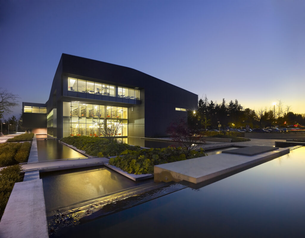
A sustainable design approach is no longer a special request but rather a necessity driven by environmental factors, clients, costs and architectural principles. From the use of recycled and sustainable materials to the innovative energy-efficient building practices, sustainable school design allows designers and builders to create environmentally friendly education spaces.
Climate and weather patterns, for example, might drive the geometries of a roof while staircases might encourage air flow. Maximizing natural light, in turn, reduces energy consumption and offers health benefits to students and teachers. Architects are also incorporating innovative, efficient and environmentally friendly geothermal heating and cooling systems in schools as passive design grows more and more important. Green building practices like this, coupled with effective insulation and the harnessing of solar energy, ensures passive building design is an affordable, smart solution for creating comfortable, energy-efficient educational spaces.
Biophilic design
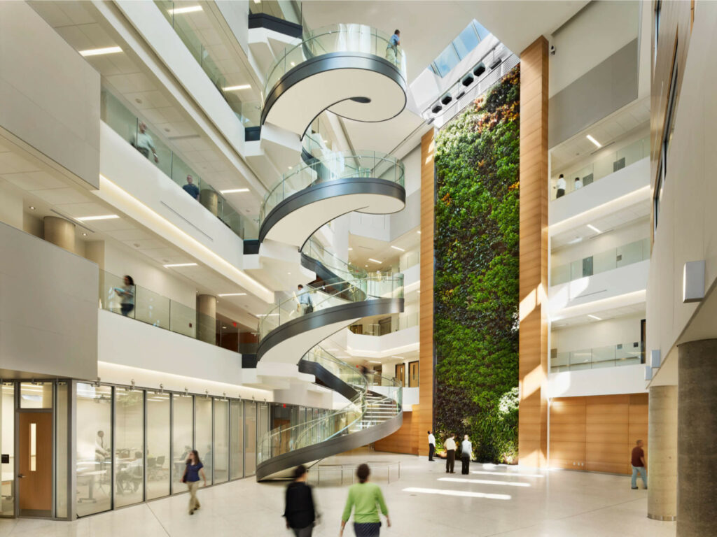
Indoor/outdoor learning experiences are vital making students more aware of their environments and importantly, connecting them to the natural world. Designers are recognizing the value and psychological benefits of incorporating green spaces into their building design. These might be inner courtyards featuring gardens, living walls or living rooftops as well as landscaping around buildings. It has been estimated that biowall systems can eliminate 60-90% of pollutants with a single pass while reducing overall airborne pollutant concentrations by more than 25% (Nedlaw).
Studies also demonstrate the value of green spaces on the mental development of young children, particularly, in terms of reducing stress and absorbing traffic pollution. In addition, offering students views of plant life, fields and trees to juxtapose roads and buildings, will enhance student learning and overall well-being.
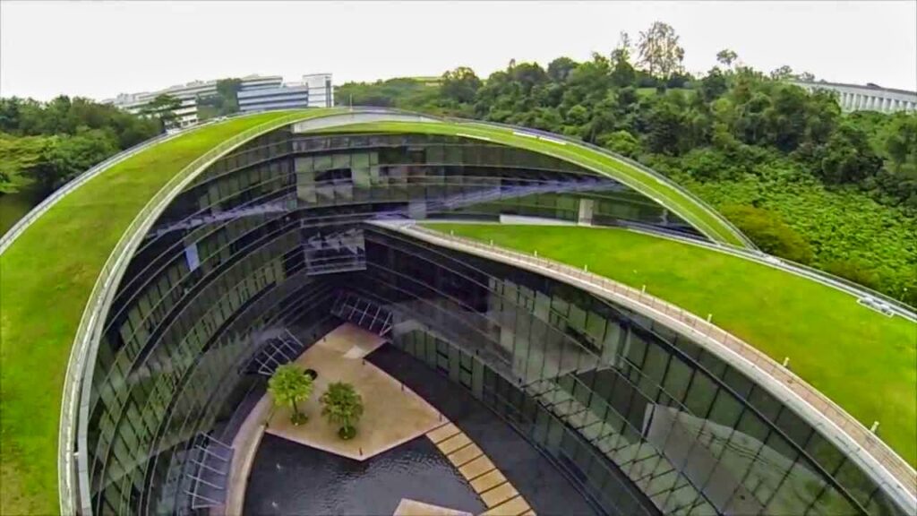
Green roof at Nanyang Technological University, Singapore | CPG Architects
Colour
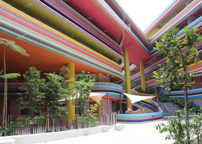
Traditionally in North America, educational institutes opted for subdued, dull colours thinking vibrancy would over stimulate students and hinder their concentration. However, this is not the case. Europeans have been using colour playfully and to great effect in their schools. And in Singapore’s, Nanyang Primary School ribbons of rainbow colour line the outdoor hallways that circumnavigate a central courtyard creating a hopeful environment for learning.
Colour can be used creatively throughout a campus for a variety of reasons:
- To build brand and identity – School colours can be used throughout a campus to reinforce brand and build school spirit.
- For way-finding and navigation in schools and around campus – Warm colours specifically draw attention and are ideal for visual, way-finding cues.
- Space identification – Colour can be used to identify certain areas and can extends to furniture which can be tailored to a university’s brand standard reinforcing school colours and brand.
- Establish a specific mood or ambiance – bright, warm colours are stimulating and encourage play while cooler colours enhance learning and comprehension. According to the Color Matters research institute, colour choice can, in fact, improve learning 55-78% and comprehension as much as 73%.
Accessibility
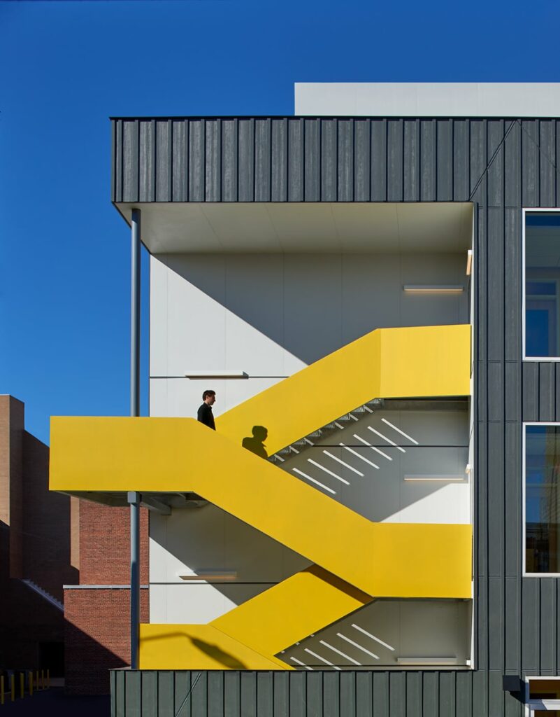
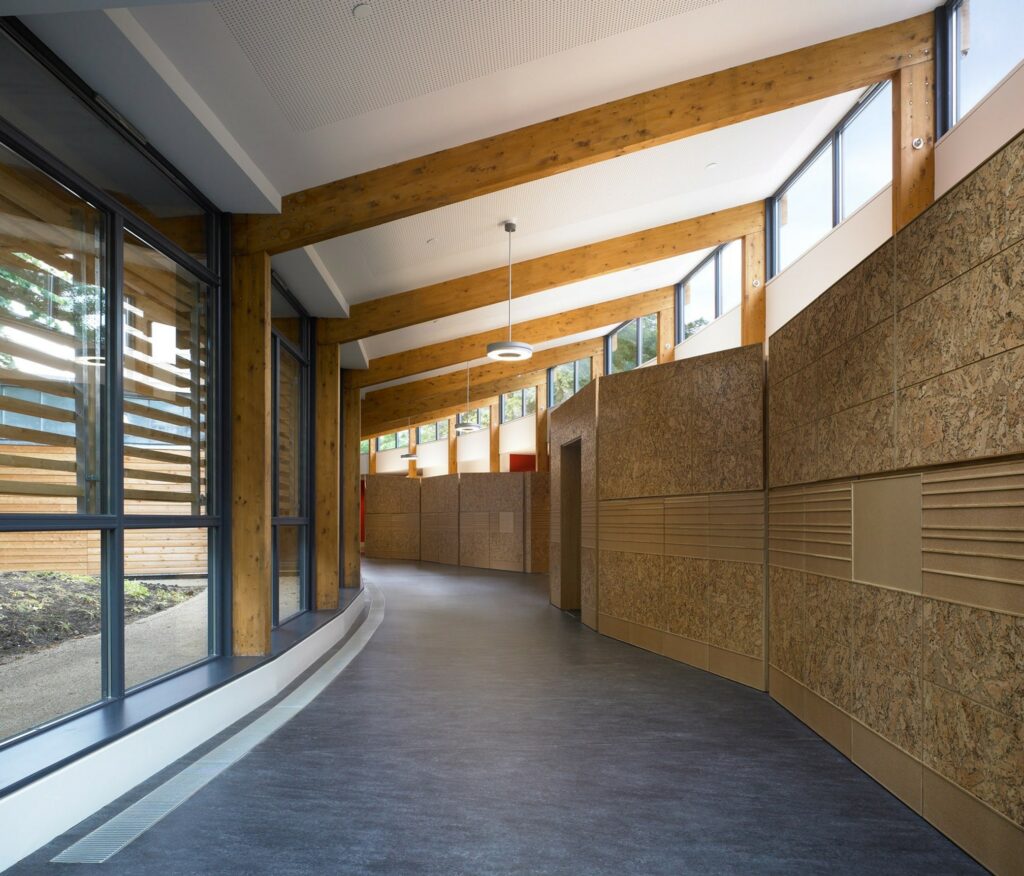
Great strides have been made in the design world in terms of accessibility for differently-abled and non-traditional students. The special needs of special students have pushed the design world in exciting and innovative ways. For example, tactile walls help blind students navigate Hazelwood School in Scotland empowering them to move around their school unassisted. In addition, bays and classrooms vary in shape and size to cue students to their whereabouts. Ultimately, accessibility is forcing the design world to think in different ways resulting in innovations that have broader applications and benefits.
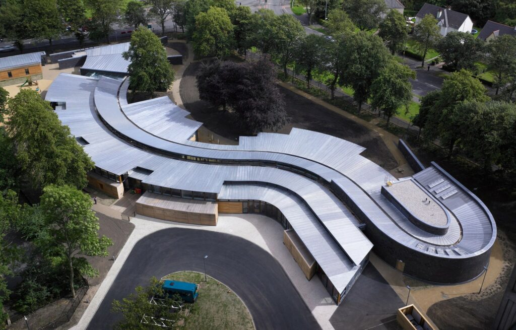
Hazelwood School | Alan Dunlop Architect | Photo:
https://www.arch2o.com
For other LIV insights and inspiration, subscribe to the LIV Design Newsletter here.
Want to see more from LIV Design? Read some of our latest posts:


