Going Green
People love plants. We may not admit to it or have any of our own but we reap great benefits from simple proximity to them. This is evidenced by the explosive growth of biophilic design. No longer a decorative afterthought, incorporating live plants into workspaces, restaurants, hotels and public buildings is now a vital, integral part of good design. And driving the popularity and growth in this area is scientific evidence supporting the very real benefits of plant life on human life.
Biophilic Design (definition) – Biophilic design is the deliberate attempt to translate an understanding of the inherent human affinity to affiliate with natural systems and processes – known as biophilia – into the design of the built environment
-Stephen Kellert, Author
Environments that incorporated natural elements reported a 15% higher well-being score and 6% higher productivity when compared to workplaces missing these elements. This impact confirms Dr. Kaplan’s Attention Restoration Theory that suggests that simply looking at nature can shift the brains thinking and help employees relax, overcome mental fatigue and concentrate better. Additionally, they improve air quality significantly and offer sound dampening qualities which, in turn, reduce the distraction of office conversations and boost creativity.
Given that productivity and retention are also improved when employees are happy, the incentive for cities, companies, hotels and restaurants to incorporate plant life into their architectural and interior designs is pretty obvious. In this article, we take a look at some phenomenal ways interior designers and architects are adding greenery to commercial spaces and in so doing contributing to the psychological well being of people around the world.
Four Principles of Good Biophilic Design
1. Use locally sourced plants to reinforce a connection to nature and organically link structures to their natural environments. Also, avoid making the major mistake made by well-meaning designers in years gone by – choosing plants that deteriorate air quality or require too much energy or water to maintain – bamboo, for example, is beautiful and versatile but can deprive neighbouring plants of water and nutrients. Not everything green is automatically good for the environment.
2. Incorporate greenery in close proximity to humans for optimal benefits and a sense of green immersion. Consider using greenery in stairwells and across walls to create powerful contrasts between the man-made and natural worlds.
3. Make it functional. Consider designing a green display that can serve as a space divider or acoustic wall, for example, as well as an air purifier and natural mood booster. Green divisions and screens in open-plan spaces, provide privacy/seclusion, soften the austerity of many offices or industrial spaces.
Amazon’s Seattle headquarters features one of the most iconic examples of functional, biophilic design – the Amazon Spheres. These three spherical conservatories are 3-4 stories high glass domes housing over 40,000 plants as well as employee lounges, workspaces and retail stores. Designed by NBBJ Architects, the Spheres are designed to foster collaboration and inspire and calm Amazon employees – recognizing they will work better if they feel better!
4. Create surprise and whimsy. Choose and use plant life to add interest to a space and stimulate conversation. Adding a tree to an indoor space is always an unexpected delight.
LIV’s Faves
Though particularly topical right now, we believe biophilic design is an important and enduring element designer will continue to consider and incorporate for all the positive benefits we’ve outlined. We are excited and encouraged by the inspiring examples of biophilic work showing up in unique and interesting ways around the world. Below are some of our favourites:
Roofhouse, Khet Yan Nawa, Thailand
Looklen architects designed this spectacular rooftop common area for a single-family home in Thailand (feature image at the top of the article). It offers an innovative and versatile indoor/outdoor space and includes a guest area, space for piano lessons, relaxation zone etc. Landscape designers helped incorporate greenery throughout this unique space ensuring sightlines all included lush, local botanicals and trees.
Slack Headquarters, San Francisco
Slack’s multi-floor headquarters in San Francisco, designed by Studio O&A is essentially a case study in weaving elements of biophilic design throughout their design vision. Inspired by Slack’s CEO, an avid outdoorsman, the space evokes elements reminiscent of mountains, deserts, and forests – each floor reflecting a different landscape inspiration. What connects them all is a prevalence of living plants – hanging, potted, or living walls. Living plant walls are always memorable especially when combined with natural elements like wood – done effectively in this example.
As well, every floor also includes conference room biophilic wall graphics created by a Slack employee/wilderness photographer Adam Torres to dramatic and powerful effect.
Jil Sander Milan Headquarters, Milan
Husband and wife, Luke and Lucie Meier were appointed Jil Sander’s creative directors in 2017 taking the helm of the fashion house in Milan. Growing up in Vancouver and Switzerland respectively, they profoundly felt the absence of nature in their adopted city and take every opportunity to escape to the mountains or sea. They’ve also sought out ways to create an intimacy with nature in the urban environment. In 2019, they collaborated with Australian artist, Linda Tegg to create a living, green installation featuring plant life indigenous to Milanese surroundings. Named “Adjacent Field”, this magnificent example of biophilic design features mosses, succulents, ivy and wild sage sourced in and around Milan. It offers the perfect juxtaposition between an austere minimalist space and the natural world adding an earthy warmth. The Meiers plan to collaborate with a different artist for every collection so this exhibit will eventually be re-purposed to form a permanent, modular garden within the space.
Spice Garden, Babylonstoren Farm Hotel, Paarl, South Africa
South Africa’s Babylonstoren hotel, on one of the oldest Cape Dutch farms, is a design lover’s dream. In fact, Elle Decor included it in its 2019 list of Best Hotels. The Spice Garden dining room, designed by Malherbe Rust Architects pays tribute to the history of the spice trade. Inspired by the mythological hanging gardens of Babylon, this restaurant space is brimming with aromatic plants infusing the air with the heady scents of local spices – cinnamon, ginger, nutmeg and cloves.
The greenhouse offers guests an intimate dining experience. They will feel the rise in temperature and humidity and learn the story of the spice route around the Cape of Good Hope in the 17th century while they dine on locally sourced and prepared dishes.
Second Home Co-Working Space, L.A.
European Co-working company, Second Home, chose L.A. as its first North American location citing the city’s diversity but also tasking itself with a mission to encourage cross-pollination across communities, industries, socio-economic classes etc. clearly setting itself apart from the clubby, exclusive vibe of members-only establishments like Soho House. It offers spaces and programming to the public and even subsidizes rent for non-profits and community groups in an effort to curate an eclectic mix of tenants. To create a truly unique space that would help Second Home achieve their vision, Spanish design firm Selgascano designed a wholly original space that is essentially a forest interspersed with office space. In fact, this Hollywood Second Home location is L.A’s densest urban forest featuring 6500 trees and plants. Selgascano’s vision aligned with Second Homes longstanding commitment to biophilic design. In fact, the first-ever talk given at a Second Home space was by Biophilic design pioneer and two- time Pultizer Price winner, Harvard professor, E.O Wilson.
(Check out our post on other innovative Co-working Spaces: Design Forward Coworking Spaces)
Seattle House, Seattle
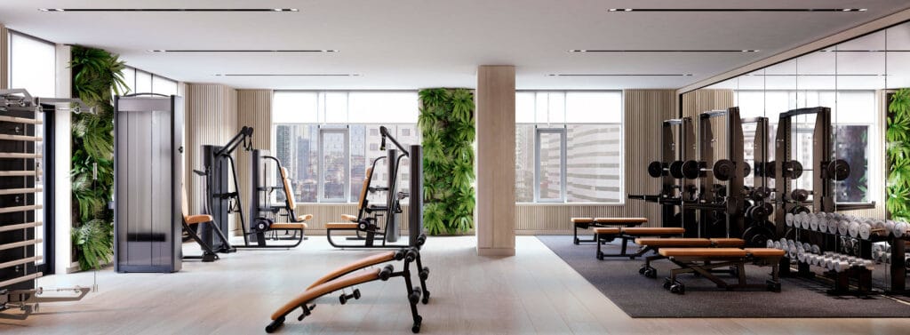
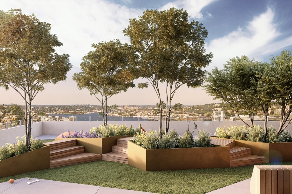
For Concord’s ground-breaking twin tower development, Seattle House, in downtown Seattle, the LIV Design team made a concerted effort to incorporate biophilic design throughout the building. Living walls are proposed for the fitness centre to help enhance the air quality and the residents’ gym experience. On the 13th level, an outdoor dog park will feature trees and plants indigenous to the Pacific Northwest to create the look and feel of a typical ground-level green space.


Think Green, Live Green
Greenery can be used as a focal point within commercial spaces, both stimulating the senses and reminding us of our connection to nature. Its very proximity to people provides a calming visual to soothe and relax the mind. We are encouraged by this quiet revolution architects and interior designers are waging to use as many natural elements as possible to mimic nature in man-made environments. In our hyper-stimulated world, this is the perfect 21st-century antidote.
Check out some of our other articles discussing design, LIV’s inspiration and projects:
2020 Colour of the Year: Classic Blue
Design Deconstructed: H Tasting Lounge
Textures and Textiles in Interior Design feat. Armani Casa
#LIVsustainably – Hotels
If you like what you see, subscribe to our newsletter here.
Cover image source: Unsplash


